Data Table
A Data Table is a way to show information in a table. It's useful for displaying data over time and across different groups. For instance, you can use it to display the top 10 servers with the highest CPU usage.
The Data Table visualization allows you to view basic information about a selected metric for a given data source for a specified time. A data-table visualization lets you display data from a metric set using a tabular view. Some key features of data-table visualization are as follows:
- Number of Rows Per Page
- Colour Coding
- Serial Numbering
- Showing Percentages
- Cumulative results
Creating a Data Table
To create the Data Table
- Create a New Dashboard Panel
- Configure the Query and select the appropriate Data Source
(Refer to Dashboard Basics > Query)
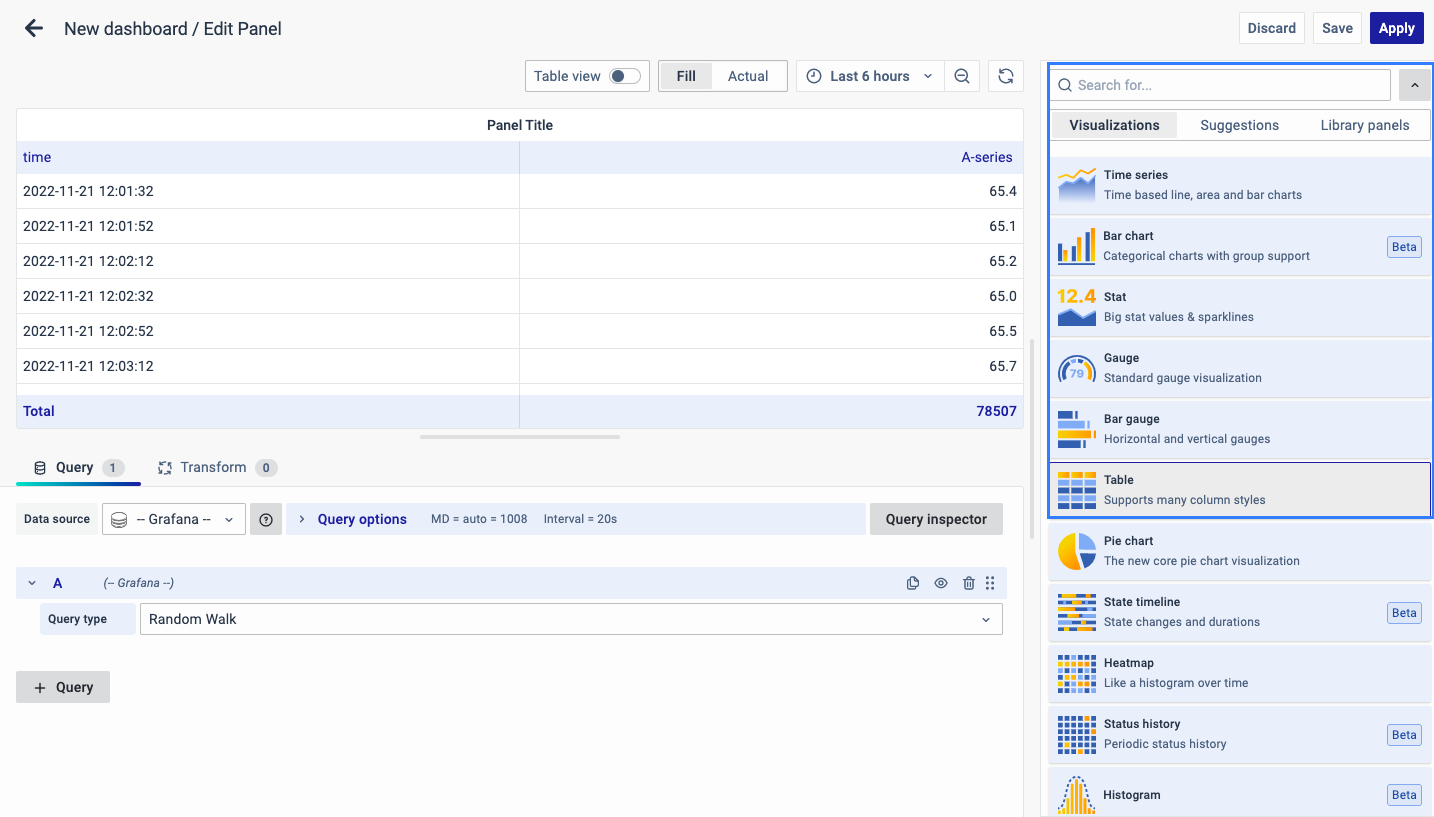
Select Visualization
On the right side of the default screen, select Visualization as Table to create a Data Table panel.
Visualization Options
Panel Options
There are multiple options to edit the properties of the panel. The first one is Panel Options. Enter a Name and Description for the Panel that you want to create. For instance, if you're making a Data Table to track CPU usage, name the panel "Data Table" and describe it as "CPU Usage."
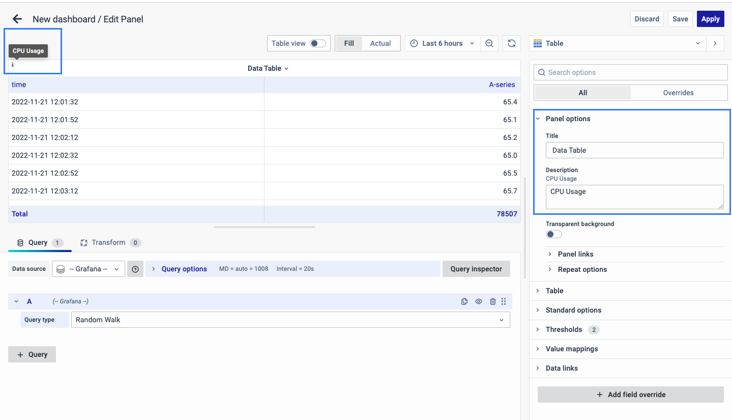
The Description is available in the top left corner and can be viewed by hovering over the i button.
The next part of Panel Options is Panel Link where you can point a link to any other website or dashboard of your choice. Enter a title, and URL, and select the ‘Open in a new Tab’ option if you want to open the link in a new tab. Click Save.
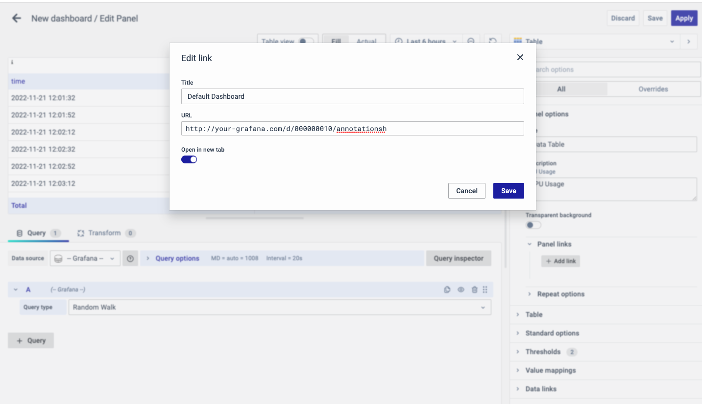
The URL can be a link to another dashboard or for getting help or useful info. When you click on a panel, it opens the link either in the same tab or a new tab, depending on your choices. For example, if you want to compare a default dashboard, just click the link to open it.
Table
The Table options allow you to change the configuration of the table and it includes:
Show Header
To display the table’s header or not.
Show Footer
To display the table’s footer or not.
Calculation
This is applicable only when "Show Footer" is enabled. Whichever reducer function we select that value will be added as a footer as a separate row.
You can choose a reducer function for calculation such as Last, First, Max, Min, Mean, Average, Total, Count, Range, Delta, Step, Difference, All Zero, All Null, Difference Percent, and All Values.
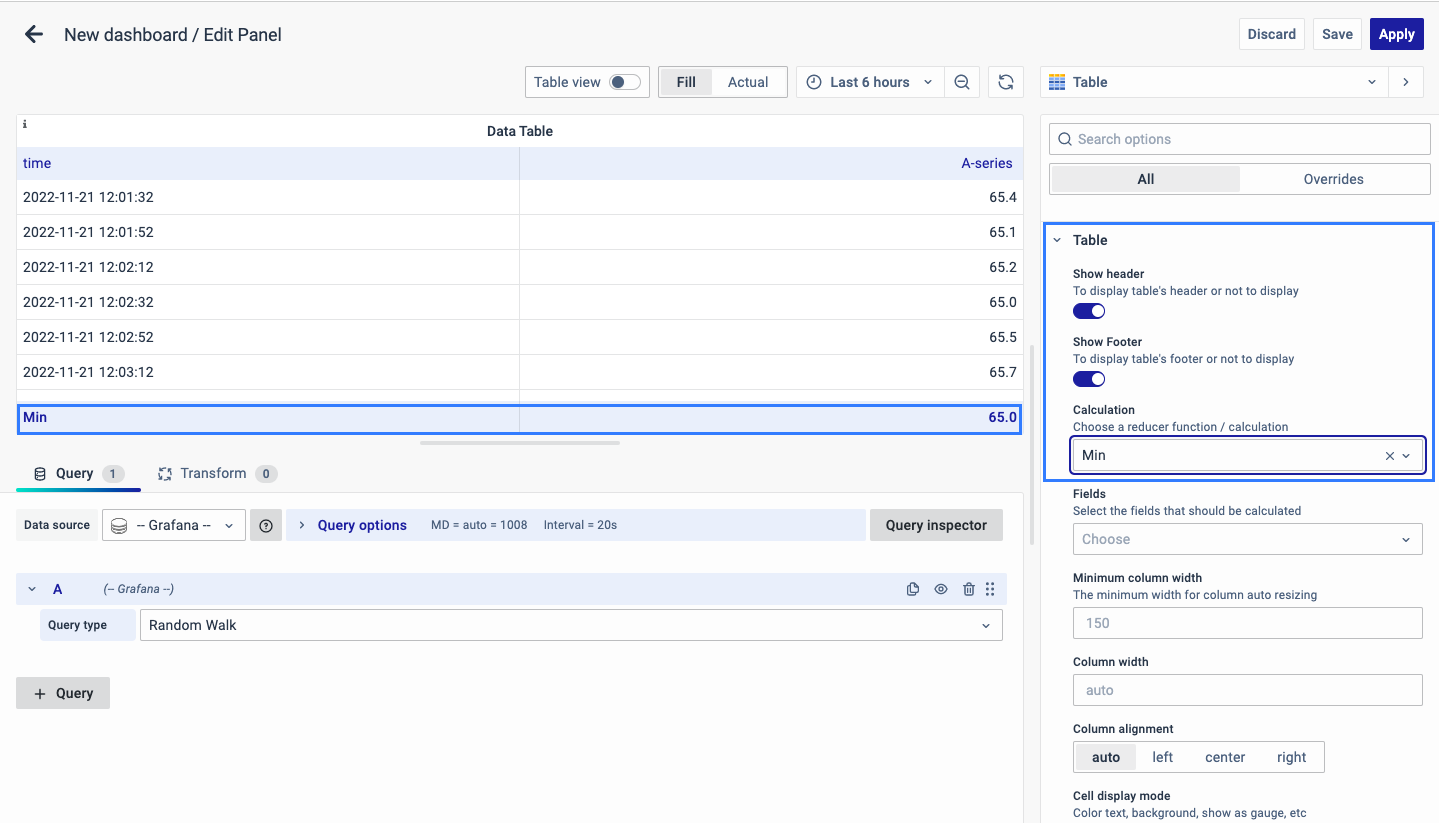
Fields
Select the Field that you want to calculate.
Minimum column width
The minimum width for column auto-resizing.
Column width
The total column width.
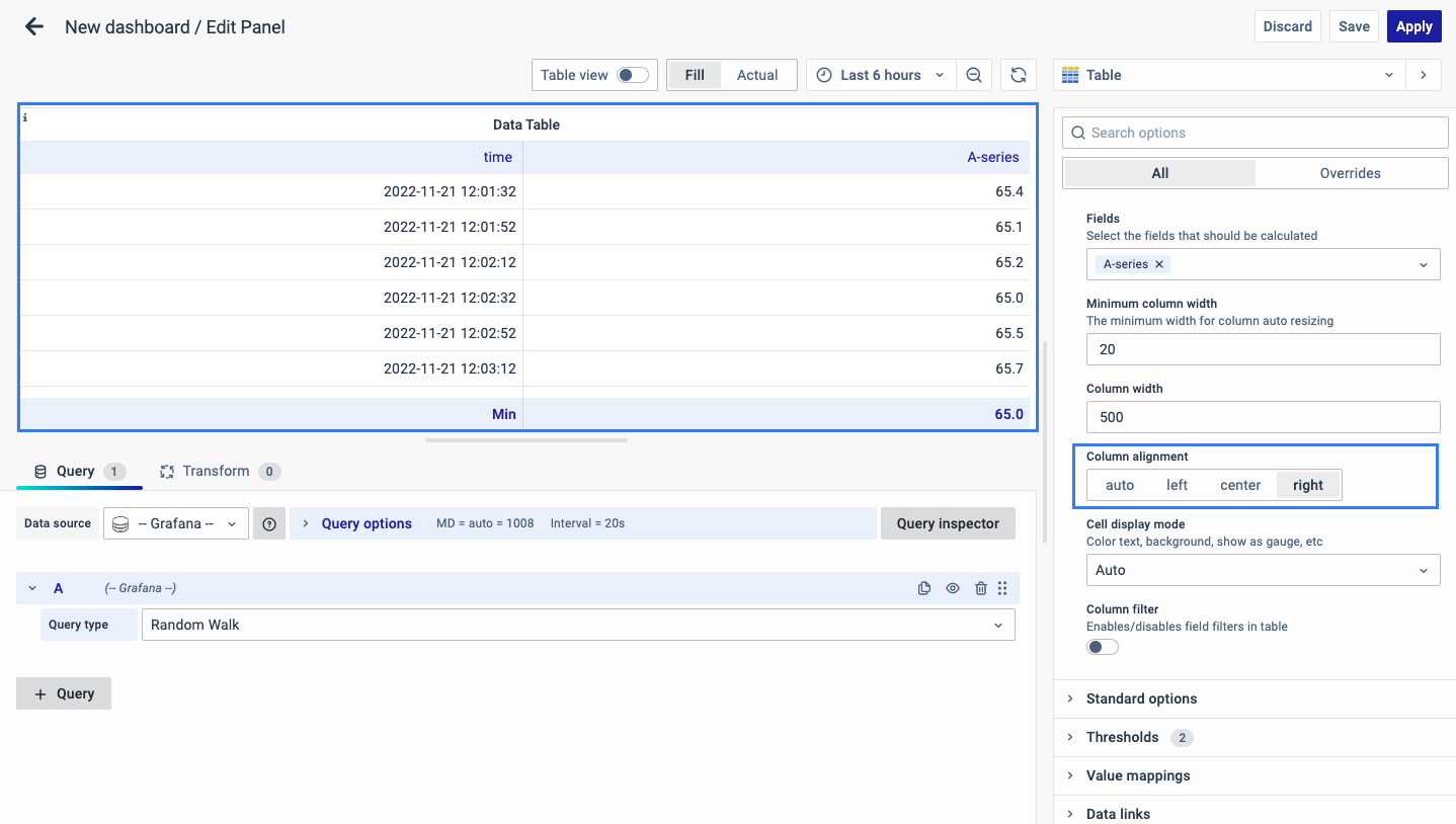
Column alignment
The type of alignment for the column values includes the following options:
- Auto

- Left

- Center
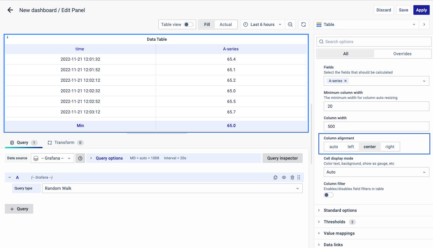
- Right
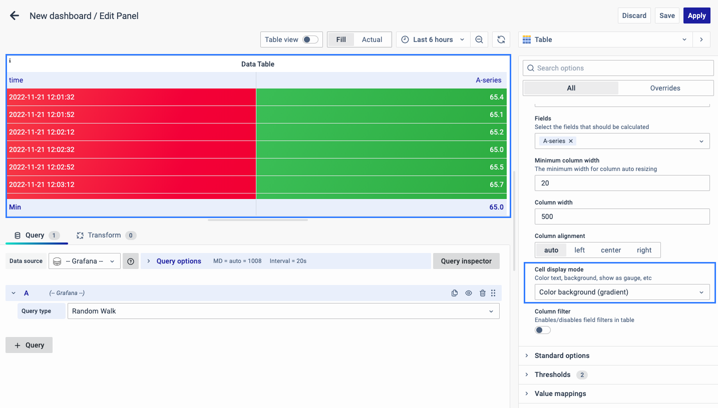
Cell Display Mode
It allows you to configure the color text, and background, show it as a gauge, etc.
Column Filter
This will enable the filter for each column present in the Table.
You can enable or disable the filters in a table.
Standard Options
The Standard Options are used to configure the other standard settings in the table. It changes the way the table appears.
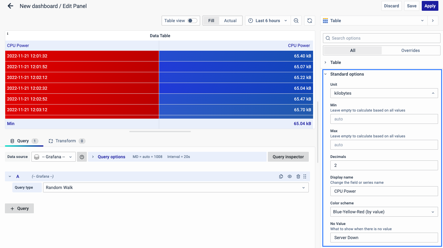
The further options include:
-
Unit type: The type of Unit parameters.
-
Min: Minimum value to be considered.
-
Max: Maximum value to be considered.
-
Decimal: Total digits after the decimal point.
-
Display name: Series name to be displayed.
-
Color scheme: choose a color scheme for the graph.
-
No Value: What to show when there is no value.
Data Links
The Data Links option is similar to the Panel Link where you can link a URL and then open it in another tab. It is placed on the data instead of the Panel.
You can click on the data anywhere and the link option will appear.
It is used for an instant link that you want to appear anytime you click on the data.
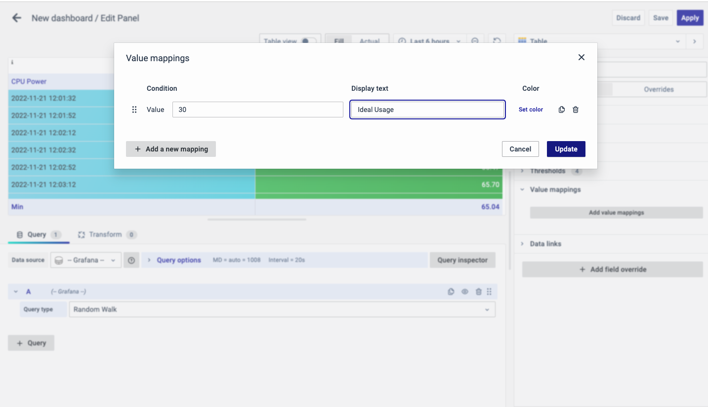
Value Mappings
The Value Mappings option allows you to find a specific value and wherever the value lies, the display text is displayed. If there is a similar value in the data, it is highlighted in the form of the color selected.
Threshold
The Threshold option is used to define the value threshold. You can set certain thresholds and color-code them.
There are two options to show thresholds mode:
-
As absolutes
-
As percentages
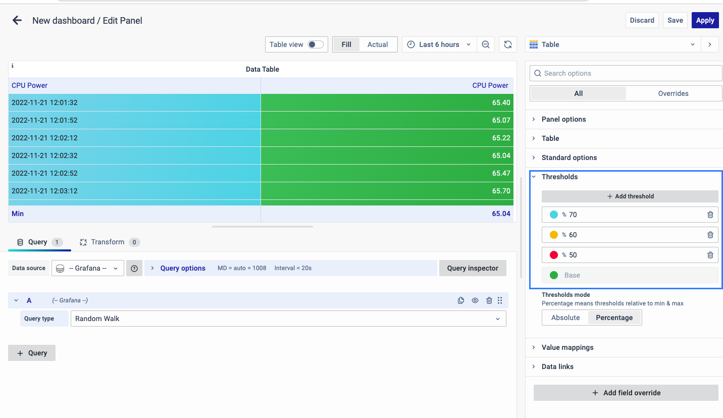
For example, CPU usage is set as red for 50, yellow for 60, and blue for 70, that way you can easily see when the output is above the threshold and immediate action can be taken or an error alert can be sent out.
Add Field Override
The Add field Override option allows you to override an existing field.
Overrides allow you to change the settings for one or more fields. Field options for overrides are the same as the field options available in a particular panel. The only difference is that you choose which fields to apply them to.
To add a field override, click on the Add Field Override button.
Select the Field type
Select a field type, based on the following properties:
-
Name: Set properties for a specific field with a name.
-
Matching Regex: Set properties for fields with name matching a regex.
-
Type: Set properties for a field of a specific type (number, string, boolean).
-
Query: Set properties from the field for a specific query.
- Select Field
- Select the override property
- Configure the override property
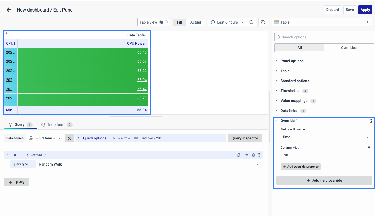
You can add multiple fields overrides by repeating the same.
You have now learned how to configure the Data Table, change the panel settings, and more. You can save and edit the panel later too.
