Area Chart
An area chart is used to display data that depicts a time-series relationship. It involves plotting data points on x- and y-axes and connecting them with lines. Area charts are primarily used when the magnitude of the trend is to be communicated rather than individual data values. This chart is effective for emphasizing trends, often by filling the area under the lines with color or shading.
Area charts are preferred when you want to communicate the overall trend in your data rather than individual values. They are especially useful for representing multiple data series with part-to-whole relationships or cumulative data sets.
Creating an Area Chart
To create the Area chart
- Create a New Dashboard Panel
- Configure the Query and select the appropriate Data Source
(Refer to Dashboard Basics > Query)
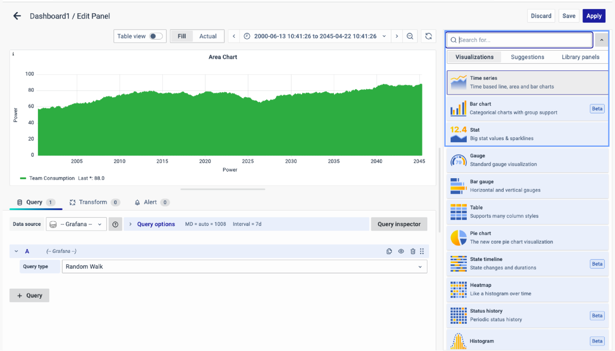
Select Visualization
On the right side of the default screen, select Visualization as Time series to create an Area Chart panel.
Visualization Options
Panel Options
There are multiple options to edit the properties of the panel. The first one is Panel Options. Enter a Name and Description for the Panel that you want to create. For instance, if you're making an area chart to track CPU usage, name the panel "Area Chart" and describe it as "CPU Usage."
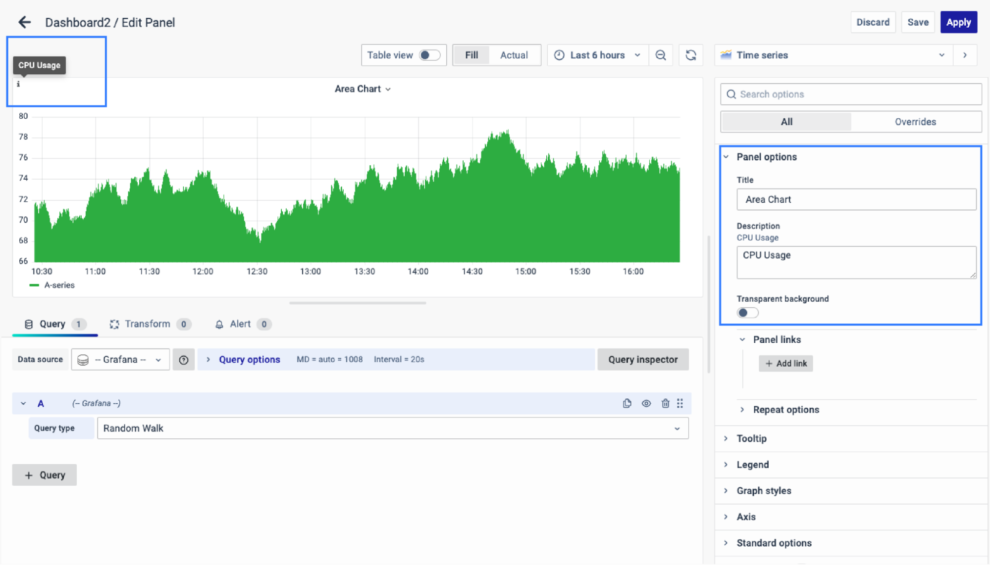
The Description is available in the top left corner and can be viewed by hovering over the i button.
The next part of Panel Options is Panel Link where you can point a link to any other website or dashboard of your choice. Enter a title, and URL, and select the ‘Open in a new Tab’ option if you want to open the link in a new tab. Click Save.
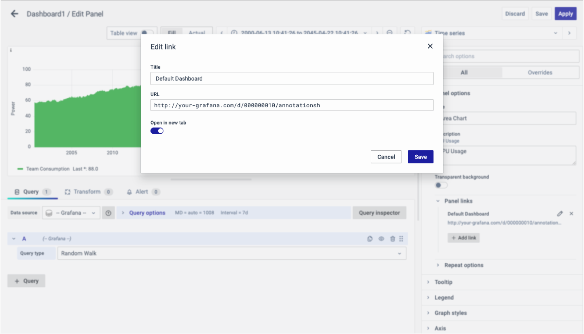
The URL can be a link to another dashboard or for getting help or useful info. When you click on a panel, it opens the link either in the same tab or a new tab, depending on your choices. For example, if you want to compare a default dashboard, just click the link to open it.
Tooltip
The next section is the Tooltip which is used to show the details of a panel.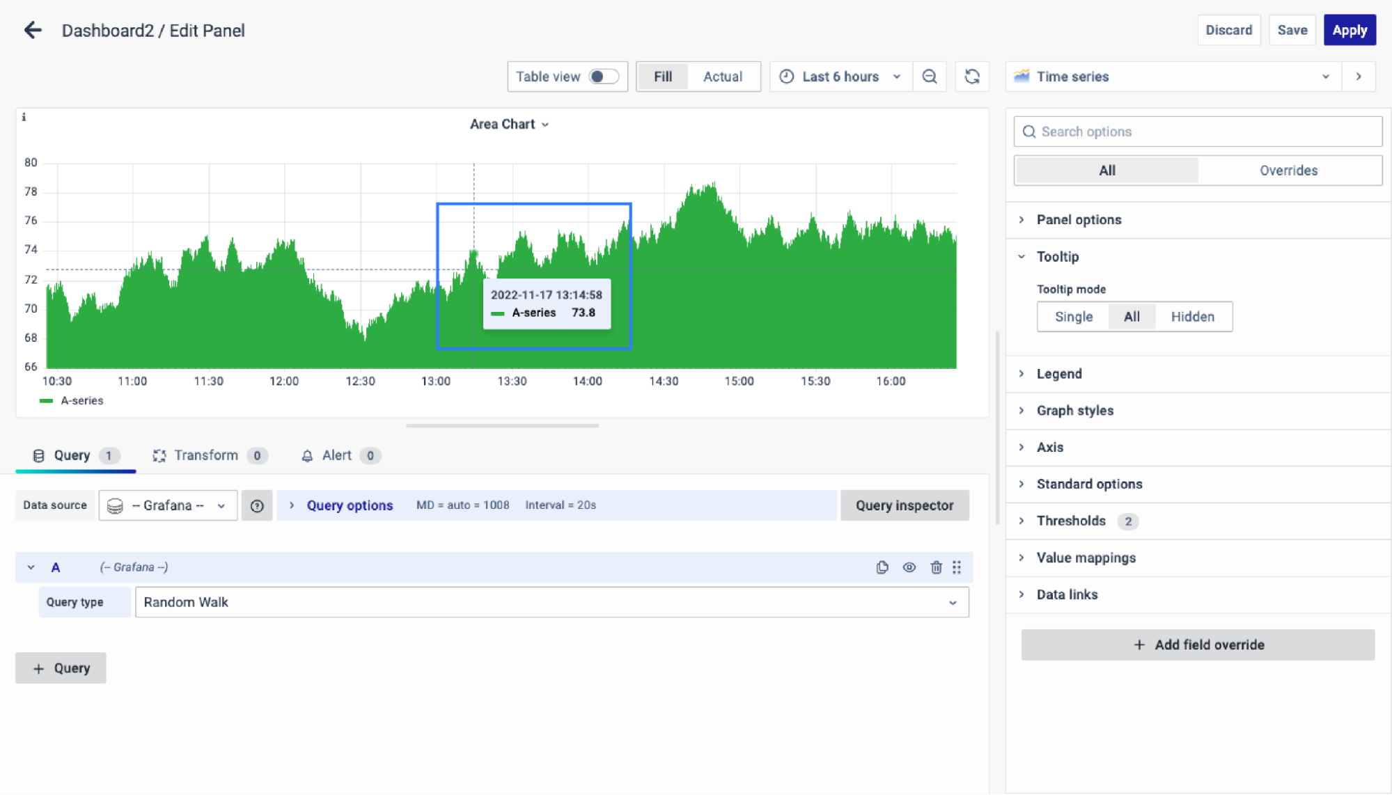
There are 3 options to configure the Tooltip:
- Single: Show the tooltip at a single point.
- All: Show the tooltip at all points.
- Hidden: The tooltip is not shown at any point.
As you can see, there is a green-colored tip showing wherever you click on the graph.
Legend
The next option is the "Legend," which essentially allows you to choose how you want the legend values to appear: at the bottom or on the right. The purpose of a legend is to provide a key or explanatory information for symbols, colors, or other elements used in a chart, map, diagram, or any visual representation
As for the Legend mode, you can display it in two ways:
- List: The legends are displayed as a list.
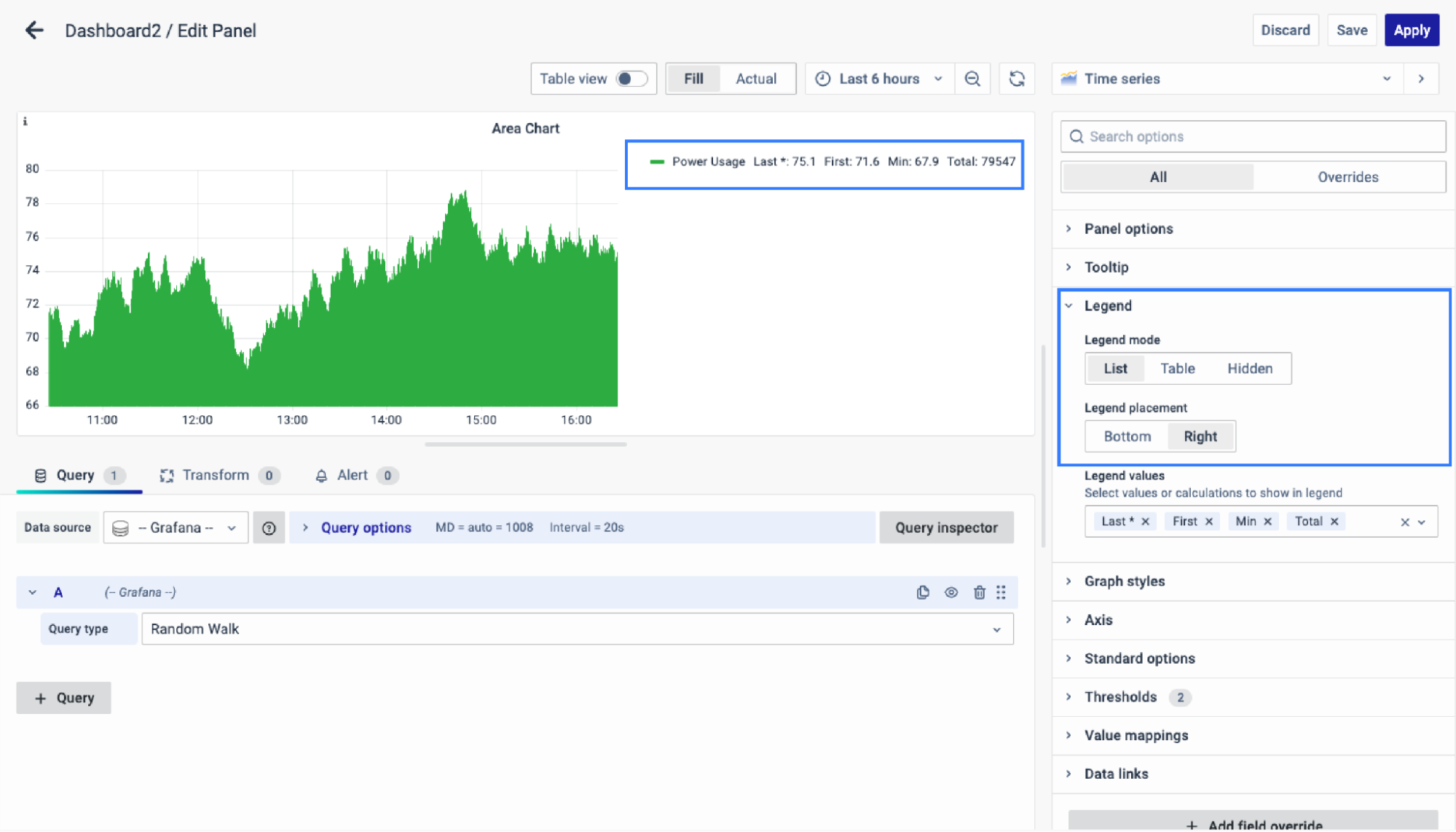
- Table: The legends are displayed as a table.
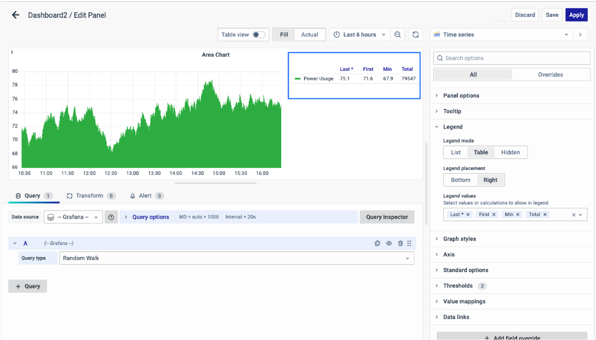
- Hidden: The legends are not displayed.
Legend Values
You can select several values such as Last, First, Min, Max, Total, etc to show in the legend. The values are the specific properties of the data.
The corresponding properties of the data will be displayed as a legend in the graph.
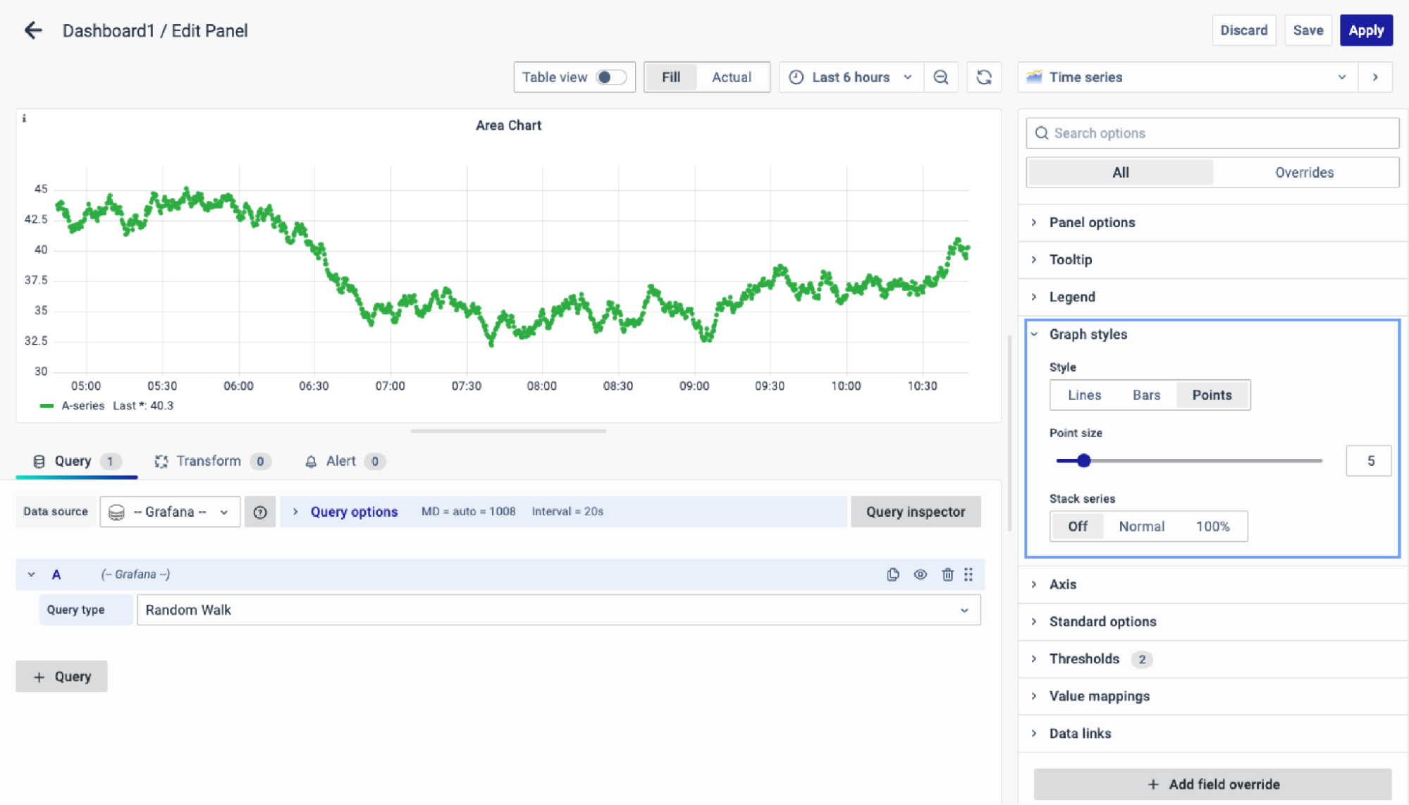
Graph Styles
Use this option to define how to display your time series data. You can use overrides to combine multiple styles in the same graph.
-
Lines
-
Bars
-
Points
Line
Line interpolation
Choose how the graph connects data points:
- Linear : Points are joined by straight lines.
- Smooth : Curved lines for smoother transitions.
- Step before : Steps between points, with points at the step's end.
- Step after : Steps between points, with points at the step's start.
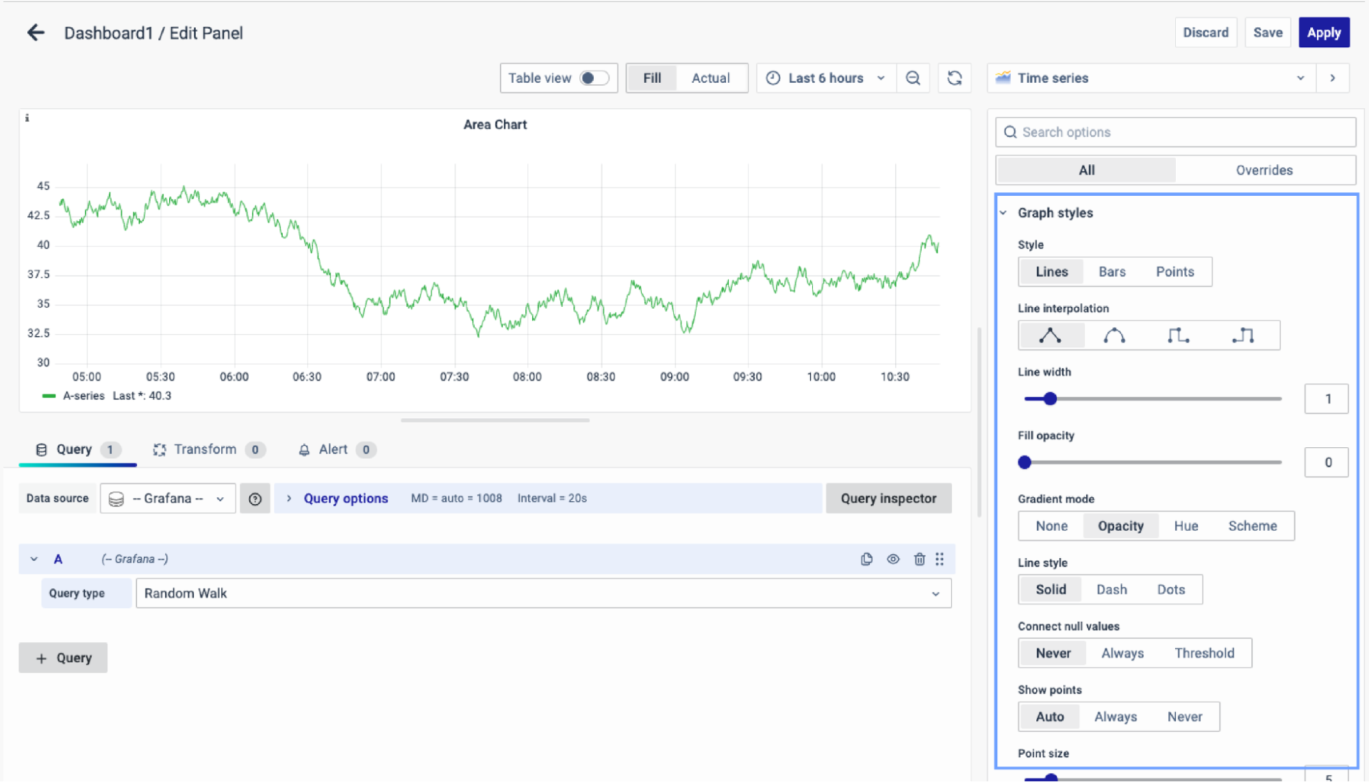
There are other options to configure such as:
- Line width: The width of the line.
- Fill opacity: The opacity of the filled region.
- Gradient mode: Specify the gradient fill color.
- Line style: Solid, dash, or dots.
- Connect null values: Choose how null values, which are gaps in the data, appear on the graph.
- Show point: Show or hide point.
- Point size: Size of the points.
- Stack series: Stacking allows to display of series on top of each other.
Bars
Bar Alignment
Set the position of the bar relative to a data point. In the examples below, Show points is set to Always which makes it easier to see the difference this setting makes. The points do not change; the bars change in relationship to the points.
- Before
 The bar is before the point, with the point at the trailing corner.
 - Center
 The bar encircles the point, with the point in the center (default).
 - After
 The bar is after the point, with the point at the leading corner.
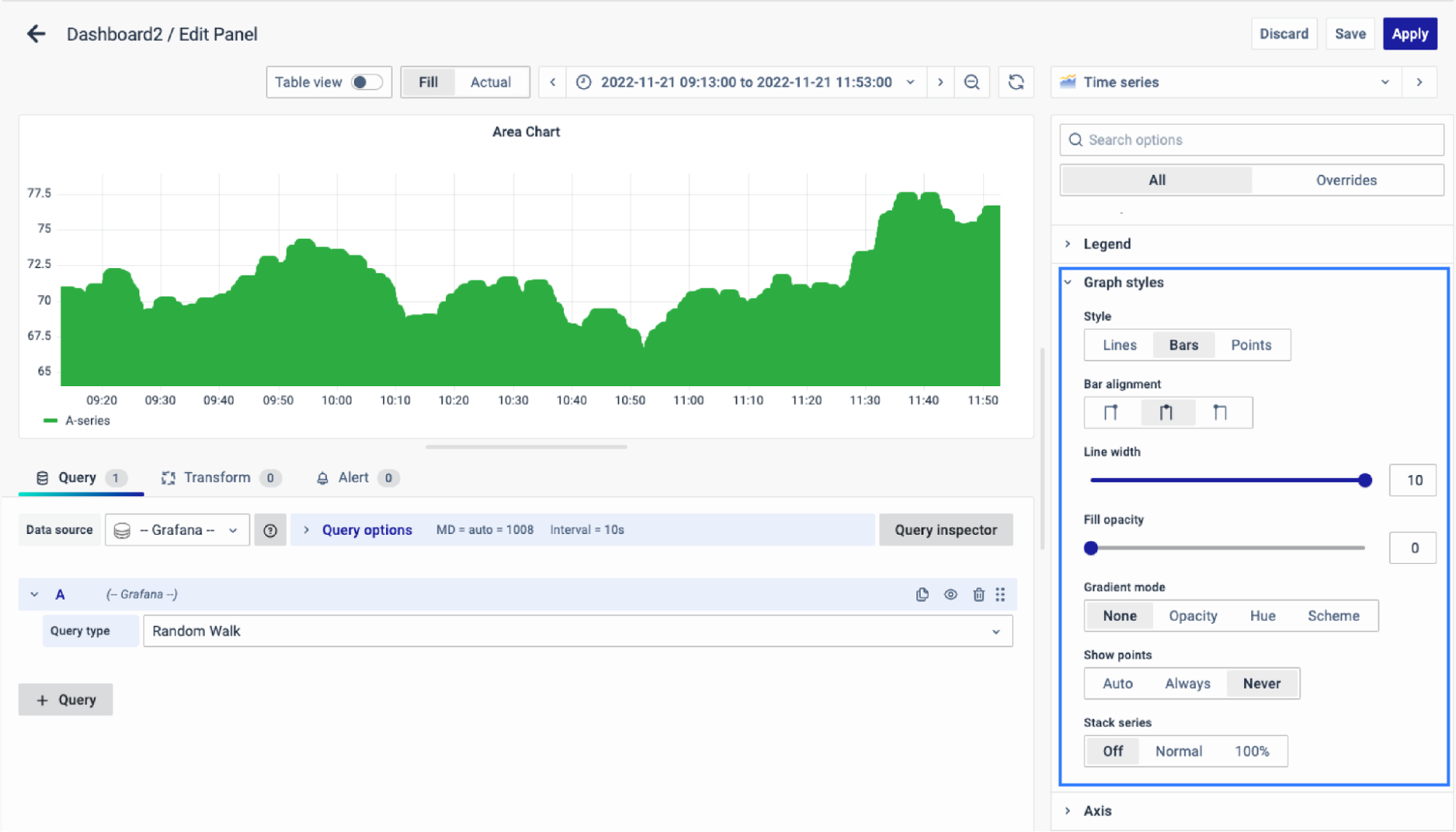
The secondary options for Bar Style Graph include:
- Line width: The width of the line.
- Fill opacity: The opacity of the filled region.
- Gradient mode: Specify the gradient fill color.
- Line style: Solid, dash, or dots.
- Show point: Show or hide point.
- Point size: Size of the points.
- Stack series: Stacking allows to display of series on top of each other.
Points
As for the Points style, it only contains:
- Point size: Size of the points.
- Stack series: Stacking allows to display of series on top of each other.
Axis
The next option is the Axis from where you can configure all the axis settings of your graph.
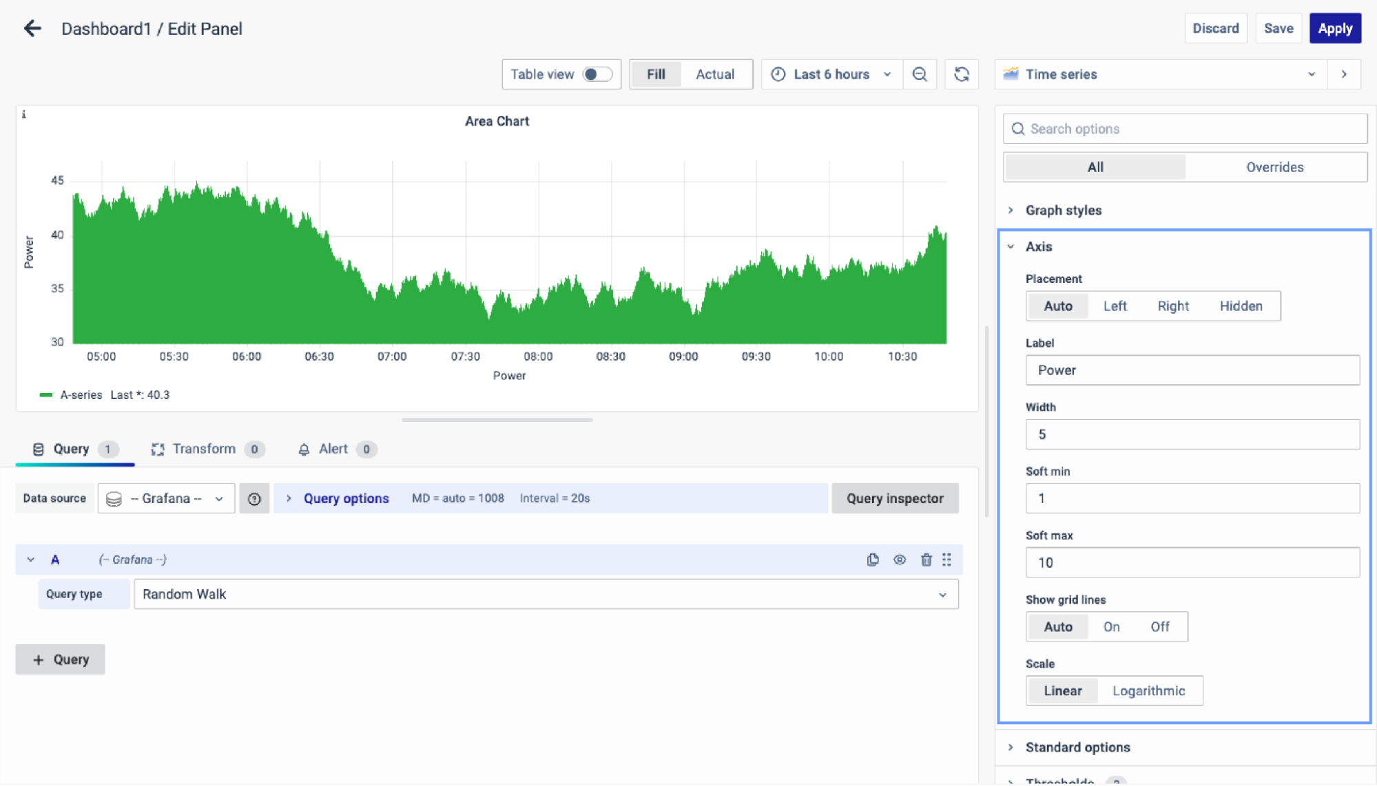
The further options that you can configure in your axis settings are:
- Placement: Choose Y-axis placement- Auto, Left, Right, and Hidden.
- Label: Set a Y-axis text label. Different labels for multiple Y-axes can be set using override.
- Width: Fix the axis width.
- Soft Min: Adjust Y-axis limits with a Soft Min.
- Soft Max: Adjust Y-axis limits with a Soft Max.
- Show Grid Lines: Auto, On, Off.
- Scale: Set the Y-axis values scale - Logarithmic or Linear.
Standard Options
The Standard Options are used to configure the other standard settings in the graph. It changes the way the graph appears.
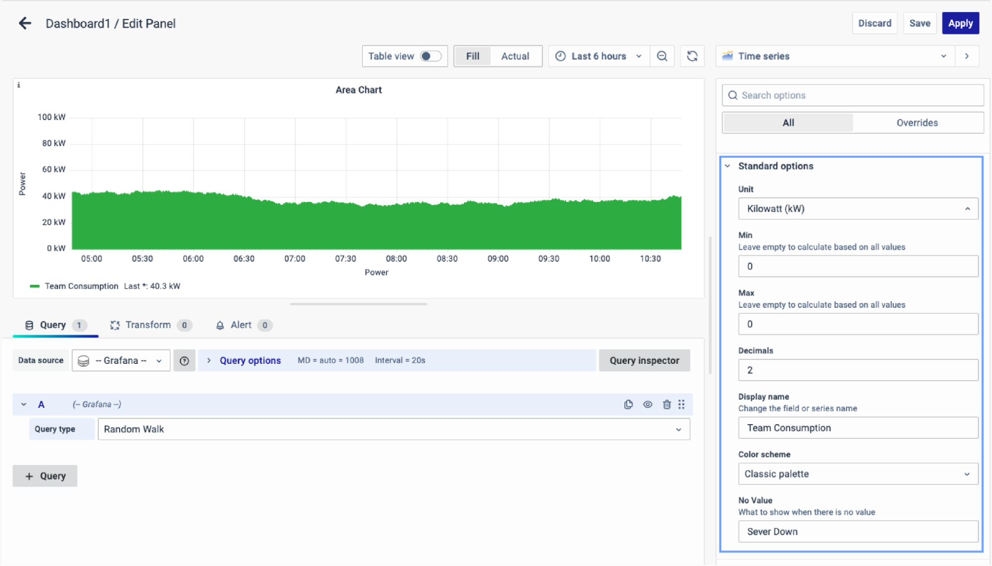
The further options include:
- Unit type: The type of Unit parameters.
- Min: Minimum value to be considered.
- Max: Maximum value to be considered.
- Decimal: Total digits after the decimal point.
- Display name: Series name to be displayed.
- Color scheme: choose a color scheme for the graph.
- No Value: What to show when there is no value.
Data Links
The Data Links option is similar to the Panel Link where you can link a URL and then open it in another tab. It is placed on the data instead of the Panel.
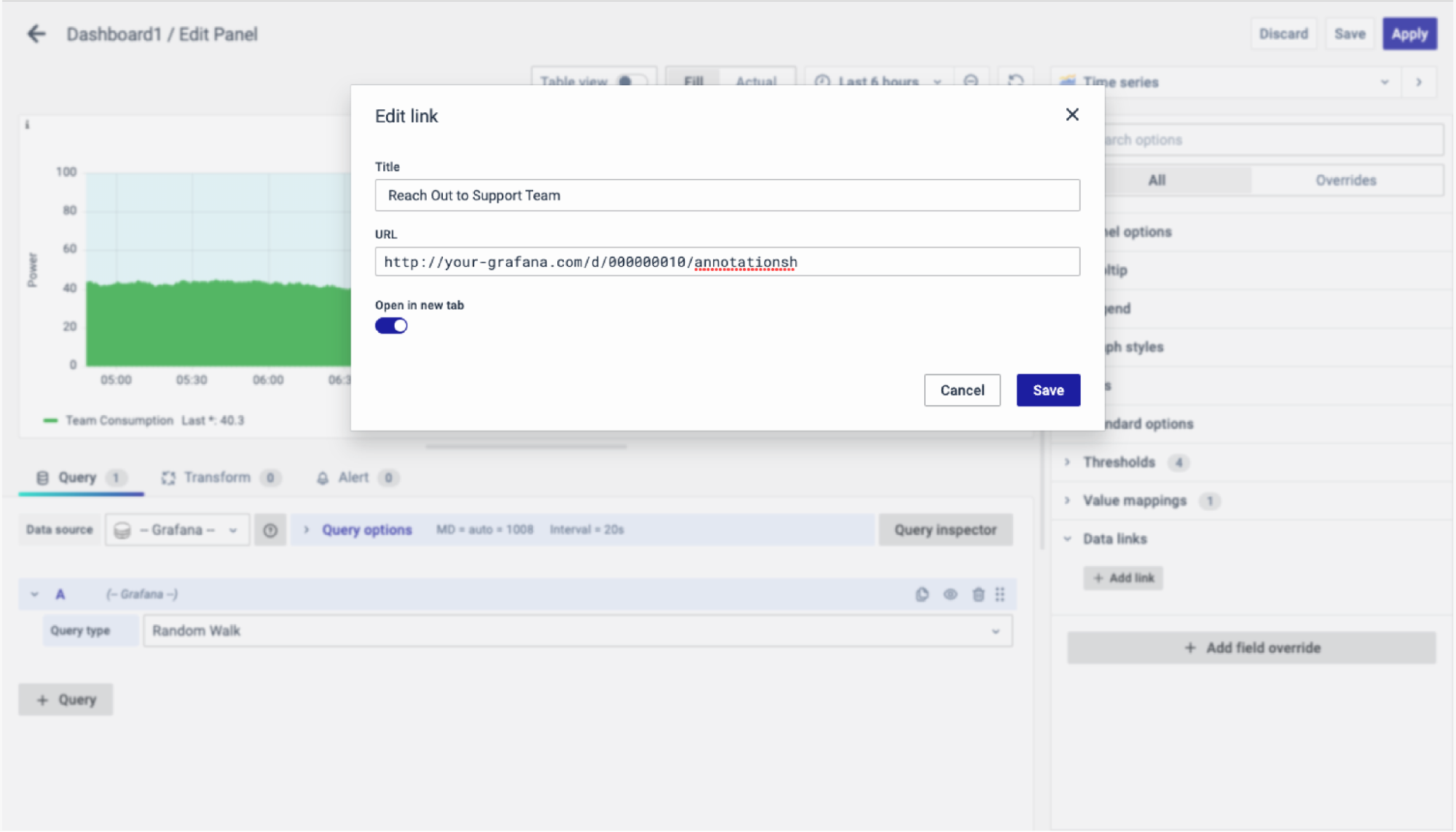
You can click on the data anywhere and the link option will appear.

It provides an instant link that you want to appear anytime you click on the data.
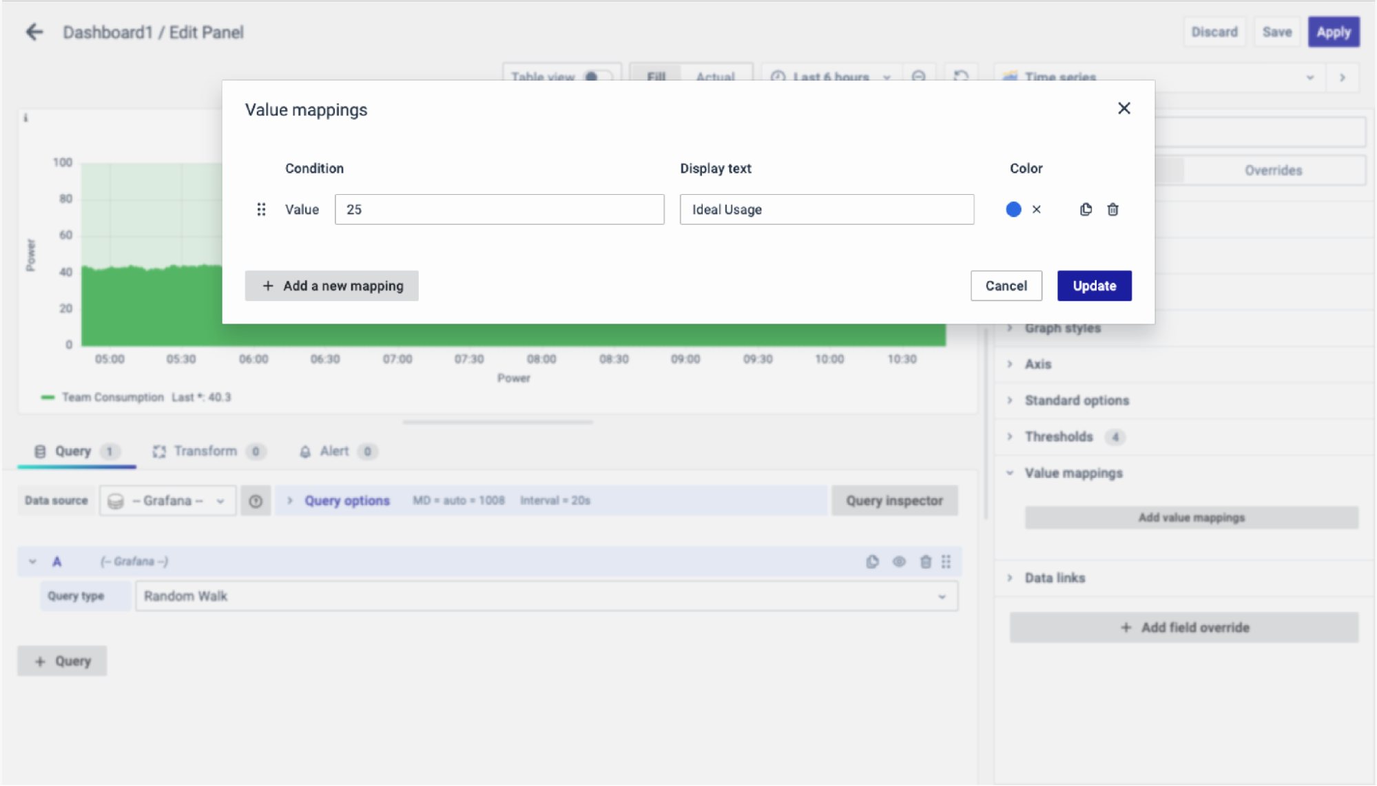
Value Mappings
The Value Mappings option allows you to find a certain value and wherever the value lies, the display text is displayed. If there is a similar value in the data, it is highlighted in the form of the color selected.
 Thresholds
The Thresholds option allows you to define and color-code value thresholds in three display modes:
- Not filled
- As lines
- As filled regions and lines
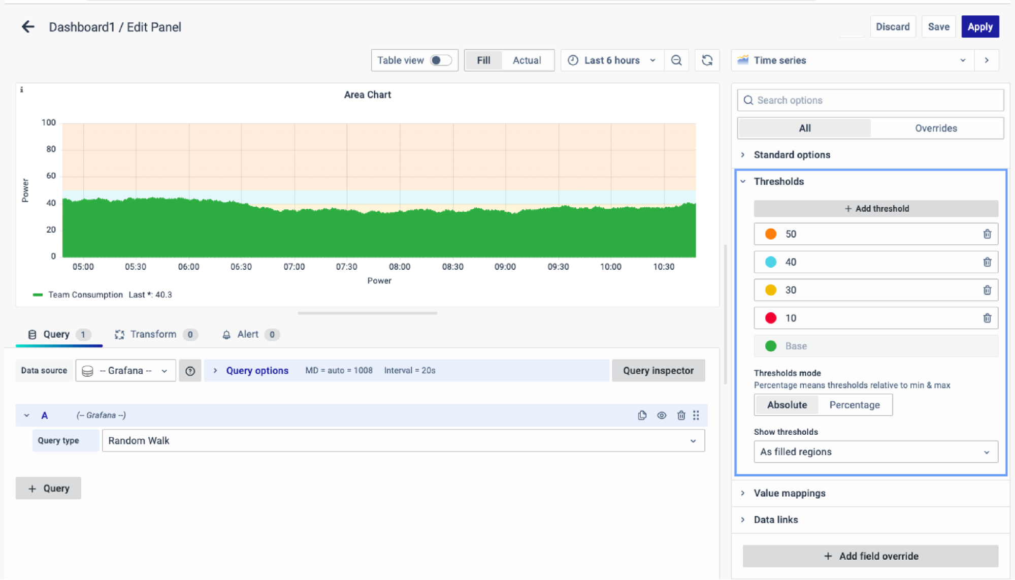
Set color-specific thresholds to visualize performance levels more effectively.
For instance, for CPU usage, use green for 30, yellow for 40, and red for 50, enabling quick detection of threshold breaches and immediate action or error alerts.
Add Field Override
Use the Add field Override option to modify existing fields. Overrides enable changes to field settings, same as the field options available in a particular panel, with the flexibility to select the target fields.
To add a field override, click on the Add Field Override button.
Select the Field type
Select a field type, based on the following properties:
- Name: Set properties for a specific field with a name.
- Matching Regex: Set properties for fields with name matching a regex.
- Type: Set properties for a field of a specific type (number, string, boolean).
- Query: Set properties from the field for a specific query.
- Select the Field.
- Select the override property.
- Configure the override property.
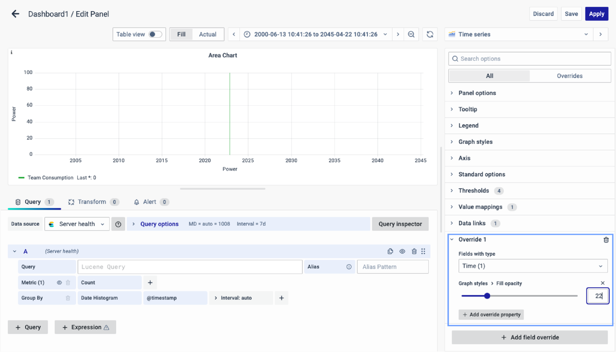
You can add multiple fields overrides by repeating the same.
You have now learned how to configure the Area Chart, change the panel settings, and more. You can save and edit the panel later too.
