Vu Dashboard List Visualization
The Vu Dashboard List visualization feature provides a streamlined way to organize and access dashboards through dynamic and intuitive card-based groupings. This functionality enhances usability by enabling users to logically categorize dashboards, streamline navigation, and tailor the interface to their needs and preferences.
Overview of Features
Category-Based Dashboard Navigation: This feature allows dashboards to be categorized logically based on their types, enhancing usability and navigation.
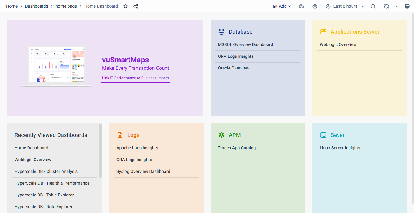
Dashboards are grouped into cards based on their functional categories. For instance:
- Server: Includes dashboards tagged for monitoring operating systems like Linux or Windows.
- Database: Covers dashboards tagged for managing and analyzing databases like Oracle, or MySQL.
- Application Server: Groups dashboards related to specific applications or services.
Tag-Based Grouping: These groupings are derived from tags configured in the Dashboards, ensuring automatic and consistent categorization. For example, O11ySources provides built-in categorization through tags, which can be leveraged to create navigation cards for dashboards from various sources. This approach simplifies navigation, enabling users to locate relevant dashboards quickly.
For example, Server or Landing Page tags can be applied to dashboards to create meaningful groupings. A Server tag might be used for dashboards focused on monitoring Linux or Windows systems. In contrast, a Landing Page tag could organize dashboards that provide a high-level overview or act as an entry point for further exploration.
Alternative Listing Methods: In addition to tag-based categorization, dashboards can also be listed using other methods, such as:
- Starred dashboards
- Recently viewed dashboards
- Specific search queries
For Instance, users can view the Recently Viewed Dashboards for quicker access. To open any dashboard, simply click on the provided link.
Enhanced Panel Customization: You can also enhance the panel component by configuring its appearance through the Customize Panel option. Click on the panel, then click 'Edit' and customize it.
Creating and Configuring Vu Dashboard List Panel
To create a new Dashboard Navigation Card, click Add at the top of the page and select Visualization from the dropdown.
Now select the Vu Dashboard List as a visualization from the list.
You will see the following option listed to configure the Vu Dashboard List panel:
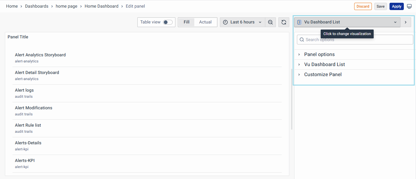
Panel Option
The Panel Options allow users to configure the appearance and functionality of individual panels. Below are the details for each option:
- Title: Define a clear and concise title for the panel, such as "Server". Text entered in this field appears at the top of your panel
- Description: Add a brief, meaningful explanation of the panel’s function.
- Transparent Background: Enable or disable background transparency to suit the dashboard’s visual design.
- Panel Links: Add links to the panel to create shortcuts to other dashboards, panels, and external websites. Access panel links by clicking the icon next to the panel title.
- Repeat Options: Set whether to repeat the panel for each value in the selected variable.
For the best UI experience, consider omitting panel titles to maintain a clean visual design and enable Transparent backgrounds to improve clarity and readability.

Vu Dashboard List
The Vu Dashboard List allows users to configure the display of dashboards with the following options:
- Include current time range: Select this option to pass the current dashboard’s time range to linked dashboards. When the link is clicked, the linked dashboard will open with the same time range applied.
- Include current template variable value: Choose this option to include template variables as query parameters in the link. When clicked, any matching templates in the linked dashboard are set to the values from the current dashboard.
- Starred: The toggle button will display starred dashboards alphabetically, making it easier to access frequently used dashboards.
- Recently Viewed: The toggle button will list recently viewed dashboards alphabetically, helping users quickly navigate to their most recent activity.
- Search: Enables dashboards to be displayed based on search queries or tags. This requires at least one value to be entered in the Query or Tags fields.
- Show heading: Use the toggle button to show or hide the panel heading.
- Show folder name: Toggle button to display the folder name for dashboards.
- Max Items: Input field to define the maximum number of dashboards the panel should display
- Add Dashboard Variables: A toggle button allows users to enable or disable appending the variables to the dashboards. By default, this option is enabled to ensure variable values are automatically propagated to linked dashboards.
- Dashboard Variables: A text box to manually enter dashboard variables in the format var-<varname>=value, such as var-Location=Bengaluru. Variable values are always synced using this syntax.
- Query: Use this field to search dashboards by name. The search is case-insensitive and supports partial matches. For instance, if dashboards are named "Server Analytics" and "Server Performance," entering "Server" will return both results. This feature simplifies finding specific dashboards quickly.
- Folder: Option to filter dashboards by their folder name.
- Tags: Add the dashboard tags, for instance, Server, and Landing Page, to automatically list dashboards under relevant category cards.

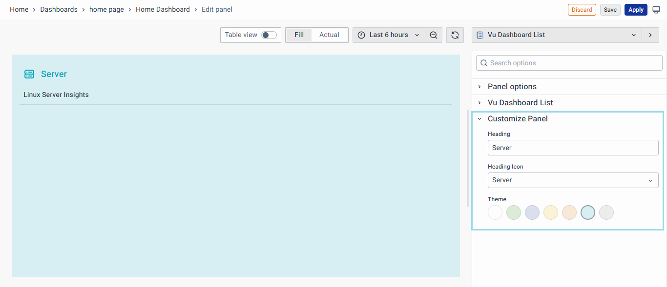
Customize Panel
This option enables you to personalize dashboard panels by adjusting headings, selecting icons, and applying custom themes for improved visual clarity and alignment
- Headings: Users can define headings for cards using a text input field.
- Heading Icon: A dropdown menu provides options for icons that visually represent each category.
- Theme: A color picker tool enables users to set unique colors for each card, aligning with branding or visual preferences.
Once done, click the Save button at the top to save the panel, which will appear as a Dashboard Navigation Card.
