Visualizations
Introduction
Visualization Panels are essential tools for data visualization and effectively presenting information through various visual elements. Explore a diverse range of charts, tables, gauges, metrics, heatmaps, and more to display your data in a manner that suits your requirements. Each panel type offers unique features and benefits, enabling you to create impactful visualizations effortlessly.
Visualization panels are divided into two categories, i.e., Predefined Panel and Custom Panel. Each panel features a query editor specific to its data source, allowing you to craft queries for visualizing your chosen data. Let's now take a closer look at each panel type to understand their distinct feature.
Predefined Panel
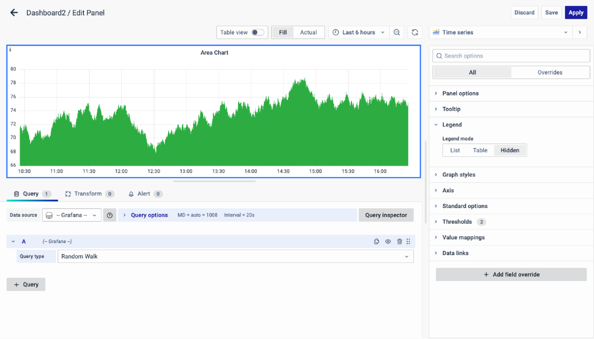
Area Chart
Area chart illustrates time-series data trends by connecting data points with lines, often filled with color or shading for emphasis
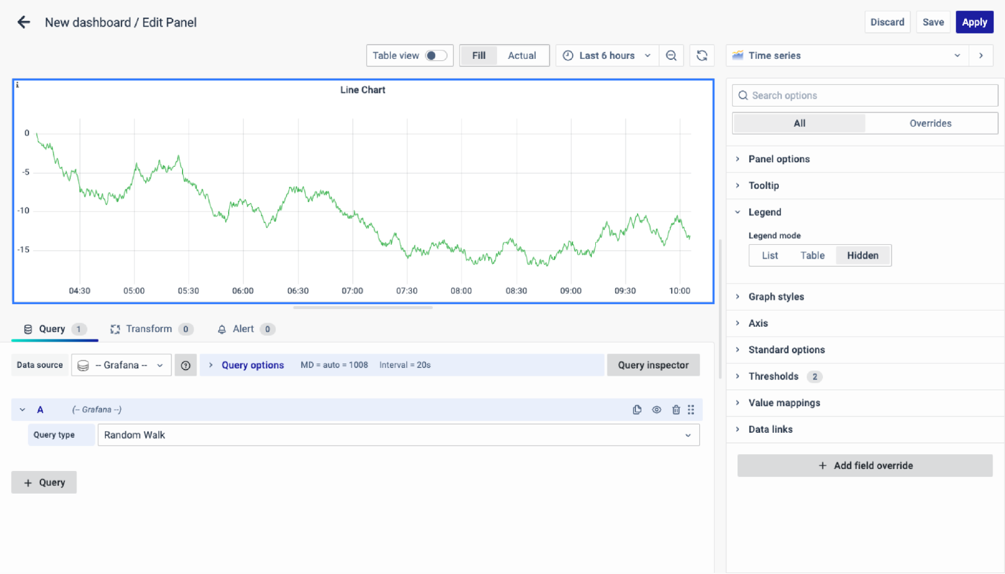
Line Chart
A Line Chart connects data points with lines to visualize changes in value, ideal for comparing trends across multiple series such as tracking profit changes for different departments over time.
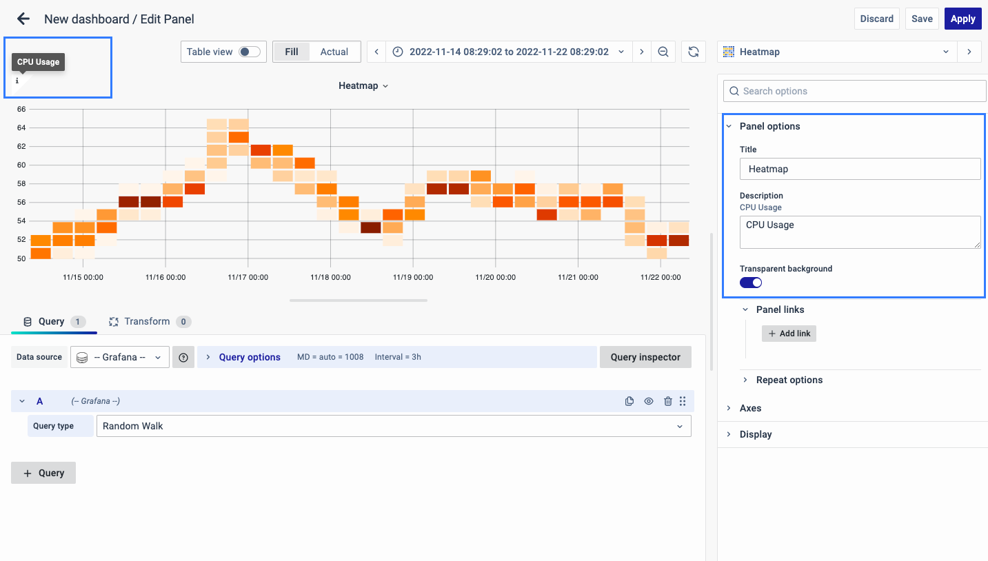
Heatmap
Heatmap visualizes data using color variations in two dimensions, offering a clear representation of distribution or changes in magnitude, ideal for transforming complex data into easily comprehensible visuals.
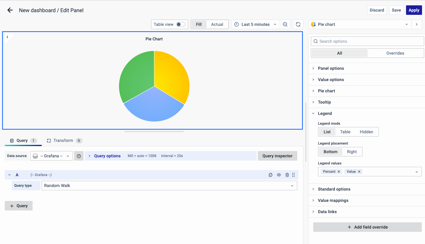
Pie Chart
A Pie Chart is a circular graphic with slices proportional to represented quantities, commonly used for illustrating percentages or proportional data, ideal for visualizing data with five categories or fewer.
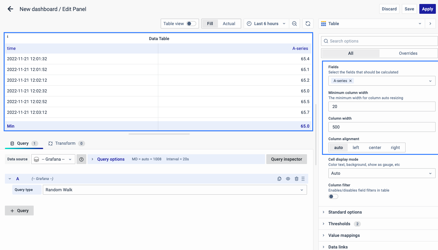
Data Table
Data Table displays information in a tabular format, ideal for presenting data over time or across different groups, with features like customizable row count, color coding, serial numbering, percentage display, and cumulative results.
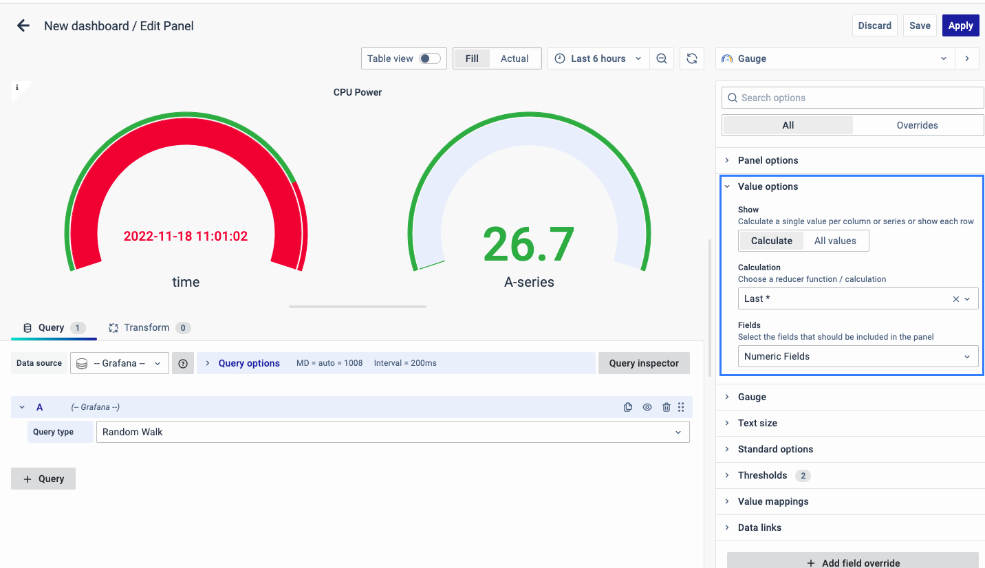
Guage Chart
Gauge Chart uses needles on a dial to visually represent data readings, offering simplicity in creation and interpretation, making it user-friendly and intuitive for displaying performance-based metrics.
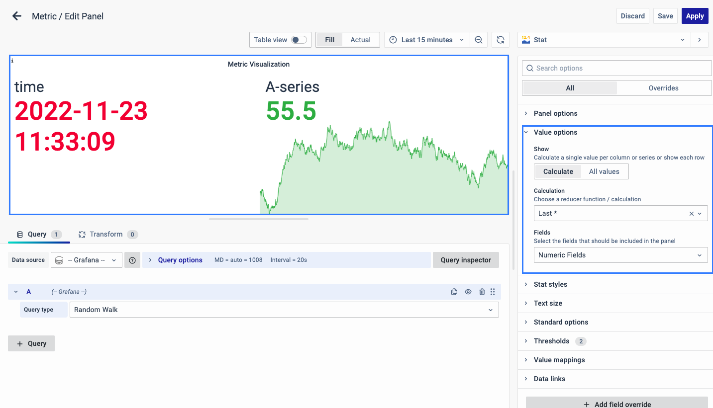
Metric
Standards for measurement or evaluation, are ideal for displaying total values and facilitating quick comparisons between different time periods, offering simplicity in data visualization.
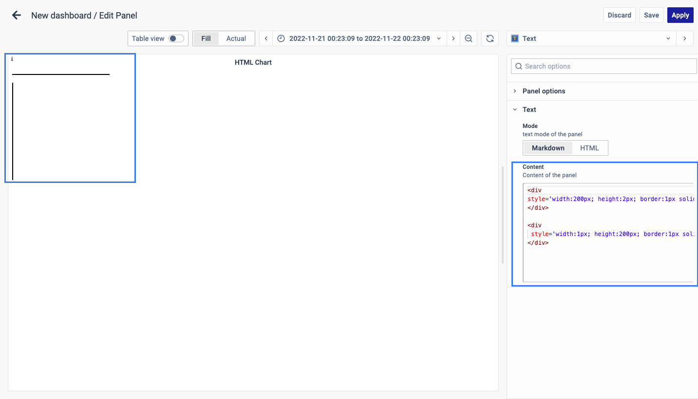
HTML Widget
HTML Widget Visualization utilizes HTML code to craft custom visualizations for dashboards, offering flexibility and enhanced functionality. Key features include error spotting with line numbers, autocomplete, auto-indentation, and collapsible/expandable HTML tags for user-friendliness
Custom Panel
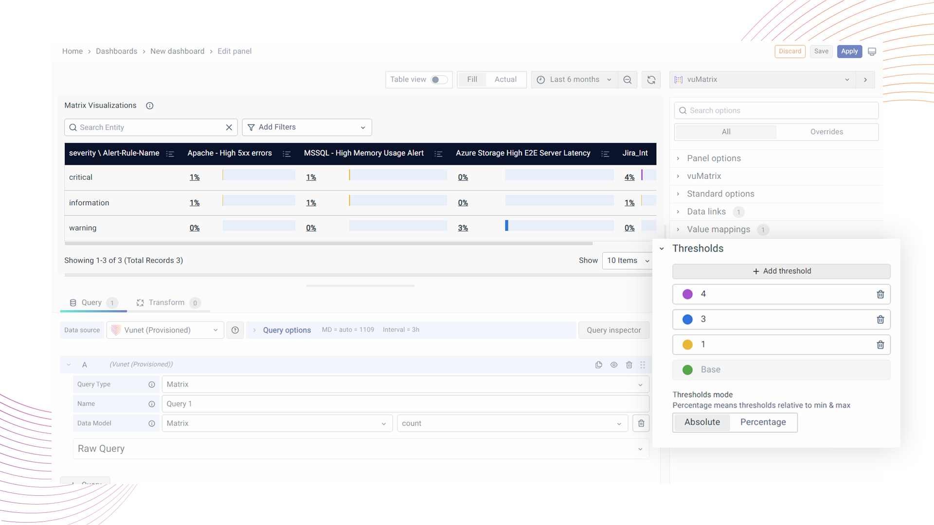
Matrix Visualization
A robust tool for tabular data presentation, ideal for displaying aggregated metrics across various groups. Key features include the ability to combine categories, organize data with row and column groups, control over displayed rows per page, color coding, serial numbering, percentage display, cumulative rows and columns, and special reporting options.
Insight Visualization
Insights are integral in business, providing deeper understanding and valuable recommendations for improvement. By simplifying complex data presentation, insight-based dashboard panels offer actionable information, enabling users of all expertise levels to make informed decisions effectively. To learn more about insight visualization refer to this link.
Unified Transaction Map
A Unified Transaction Map (UTM) visually represents the flow of components within a network, application, or transaction. It highlights key metrics for each node and link and offers insights into the stages of business transaction phases. To learn more about UTM refer to this link.
