vuApp360 Dashboards
vuApp360 Dashboards, pre-packaged with vuApp360, can be accessed by navigating to the Dashboards UI from the left navigation menu, Dashboards. On the Dashboards landing page, Service Catalog can be accessed with the help of Search bar. The Service Catalog dashboard is stored under the vuApp360 folder.
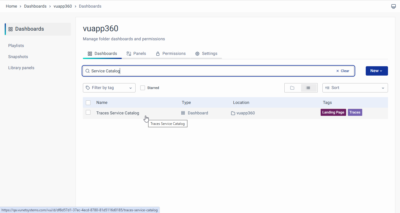
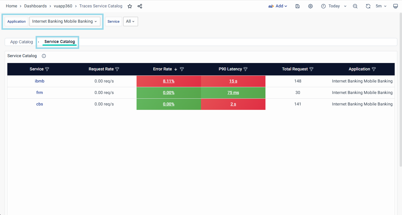
After navigating to the vuApp360 dashboard, the landing page will be the Service Catalog page as shown below:
vuApp360 offers a variety of screens to provide you with valuable insights into your application's performance. Here are the available dashboards:
- Application Overview Dashboards: Provides a high-level summary of your application's performance metrics and key indicators.
- Service Catalog: Displays a catalog of services utilized by your application, facilitating effective service management and optimization.
- App Catalog: Offers insights into the various applications within your system, allowing for comprehensive management and analysis.
- Metrics Overview Dashboards: Presents an overview of performance metrics, enabling quick assessment and monitoring of key parameters.
- Error Rate Breakdown: Breaks down error rates by type, source, or other factors, aiding in the identification and resolution of errors.
- Latency Breakdown: Analyzes latency patterns across different components of your application, helping to pinpoint areas for optimization.
- Service Overview Dashboards: Provides a detailed overview of individual services, including performance metrics and usage statistics.
- Service Summary: Summarizes key performance indicators and metrics for each service, offering insights for performance optimization.
- Service Map: Visualizes the relationships and dependencies between different services in your application, enhancing system understanding and troubleshooting.
- Transaction: Tracks and analyzes transactions, facilitating performance optimization and ensuring efficient API usage.
- Analyze Errors: Offers insights to analyze and troubleshoot errors, aiding in error resolution and prevention.
- Server Error Traces: Lists transactions with server-side failures (HTTP 499-600), allowing users to analyze and troubleshoot backend errors.
- Client Error Traces: Displays transactions with client-side failures (HTTP 399-500) to help identify and resolve incorrect or unauthorized requests.
- Analyze Latency: Provides tools to analyze and diagnose latency issues, helping to improve system responsiveness and performance.
- Traces Listing: Presents a list view of traces, for easy reference and analysis of traces.
- Trace Map: Visualizes trace data in an interactive map format, providing a detailed view of application performance and behavior.
The Pre-Sampling RED Metrics dashboard, initially designed to display RED metrics data, has been deprecated and removed starting from the NG2.14 release. The existing dashboards now offer enhanced accuracy and reliability in presenting RED metrics, ensuring that all panels display the correct data.
In the following sections, we will delve into each screen in detail, exploring their functionalities and how they empower you to optimize your application's performance and deliver an exceptional user experience.
Application Overview
The Application overview dashboards in vuApp360 empower IT Ops, Application Owners, and Business Heads to gain comprehensive insights into their application landscape. It allows to view all the applications in the environment, understand their criticality, and observe their performance metrics in real time. With the Service Catalog and App Catalog options, you can quickly identify problematic applications/ services, predict performance changes, and efficiently troubleshoot issues. This section will guide you through the functionalities and benefits of the Service Catalog and App Catalog.
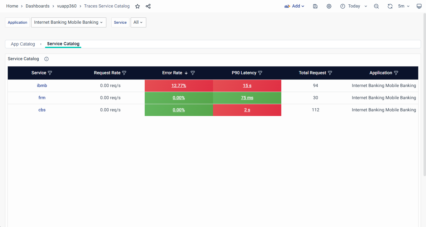
Service Catalog
The Service Catalog presents services in a structured tabular format, showcasing key performance metrics.
- Gain a consolidated view of all services within an application or all applications, simplifying observability and management.
- Effortlessly drill down into specific services for more detailed performance analysis and efficient troubleshooting.
This is the default landing page after navigating to the vuApp360 dashboard, shown below:
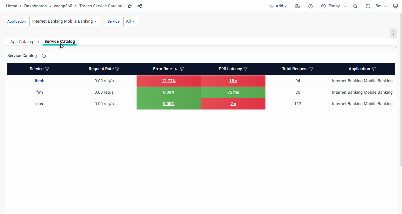
Here are the main functionalities of the Service Catalog:
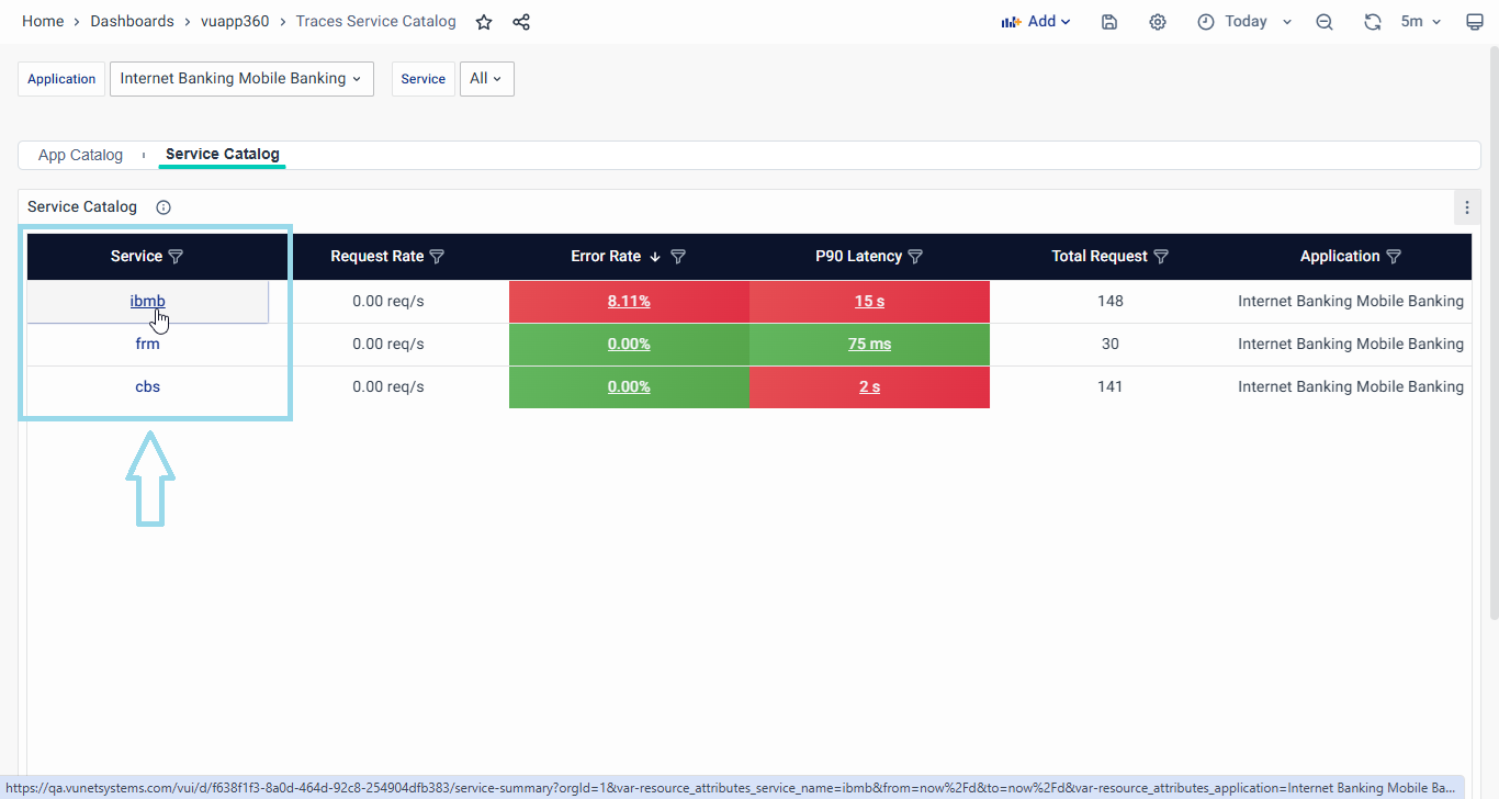
- Overview of Services: Instantly access a comprehensive list of all services running in a specific application. The tabular layout displays essential details, including the service names, Request Rate, Error Rate, and P90 Latency.
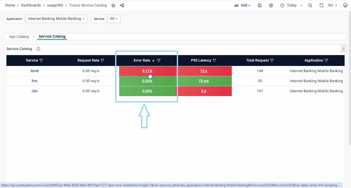
- Service Summary Dashboard: By clicking on a specific service, users are seamlessly redirected to the dedicated service summary dashboard. This feature enables you to drill down into individual service details, providing a more in-depth analysis of its performance. The details of the Service Summary dashboard are discussed in further sections.
- Filter by Application/Service: Effortlessly filter the Service catalog to focus on a specific application and view the services involved in that particular application. This feature aids in isolating performance issues and understanding the specific application.
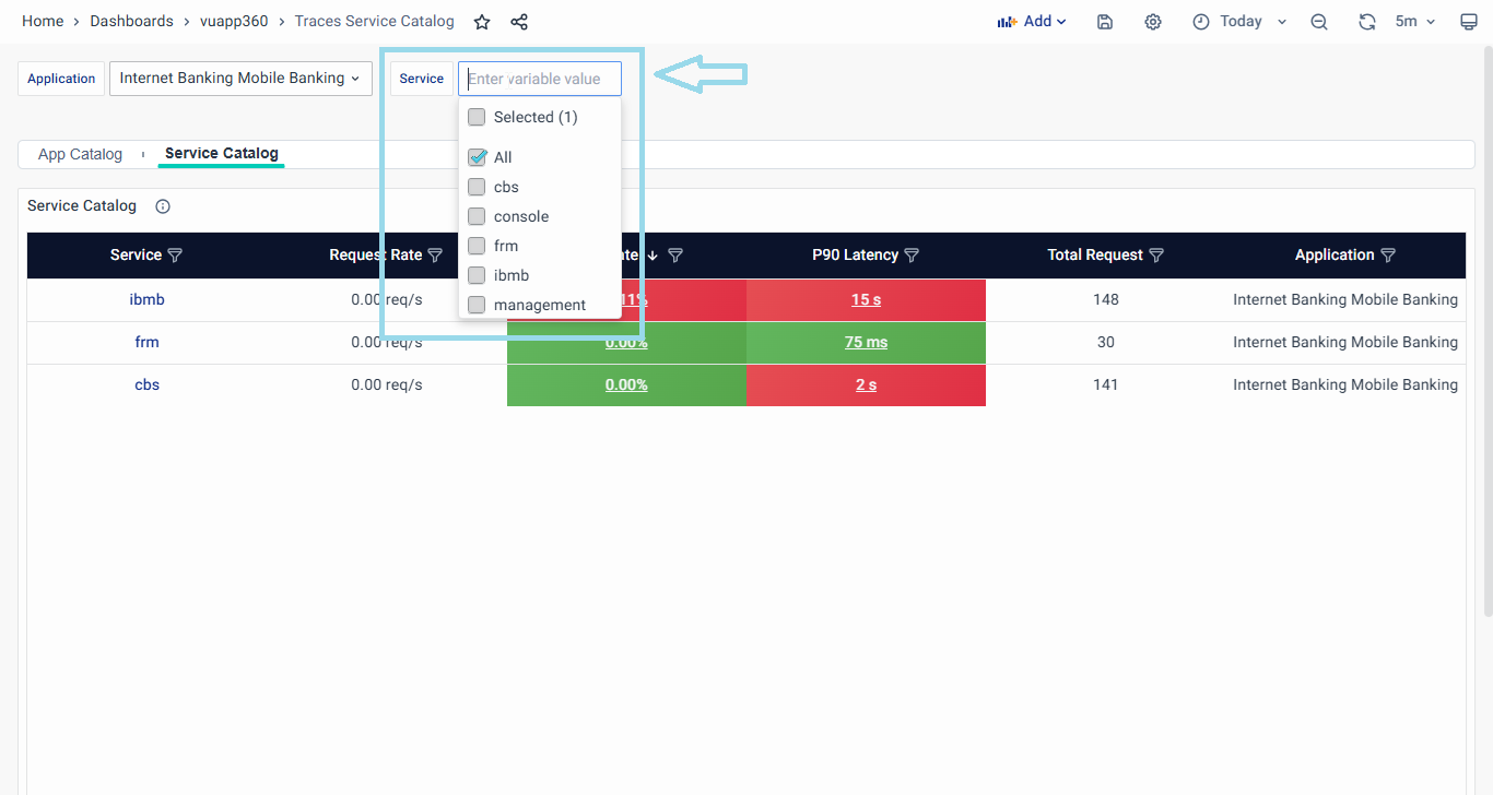
When accessing the Service Catalog tab, be aware that by default, all services for all applications are displayed. However, if you navigate by clicking on a specific arrow button on the App Catalog page, that particular application will be selected, and the filter will be pre-applied.
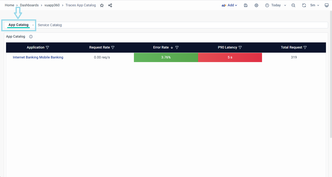
App Catalog
The App Catalog offers a bird's-eye view of all the applications in the environment, along with essential performance metrics and status information.
Let's explore the key features that make the App Catalog a valuable tool for application observability:
- Overview of Apps: With just a glance, you can access a comprehensive list of all applications. The easy-to-navigate console ensures quick access to critical information and provides info on RED metrics along with Total requests. For each app it displays crucial performance metrics - Request Rate, Error Rate, and P90 Latency (90th percentile latency).
- Criticality-Based Ordering: To prioritize troubleshooting efforts, the App Catalog presents apps in decreasing order of their criticality. Critical apps indicate that they require immediate attention. On the other hand, apps with no issues assure you of their optimal performance.
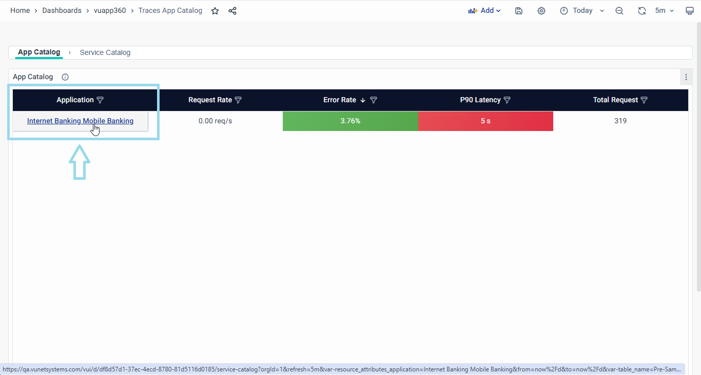
- Navigating to Service Catalog Page: To access the service catalog page, simply click the Application name. This action will seamlessly direct you to the service catalog, automatically applying the filters associated with the chosen application. For an in-depth understanding of this page's functionalities, refer to the comprehensive discussion in the Service Catalog section of this guide.
- Navigating to Error Rate Breakdown Page: Easily navigate to the Error Rate Breakdown Page by clicking on the relevant error metric showcased on the Application Catalog page. This user-friendly approach will instantly navigate you to the Error Rate Breakdown Dashboard, where you can gain insights into error occurrences within the selected application. For a thorough understanding of the capabilities offered by this page, refer to the detailed Error Rate Breakdown section in this guide.

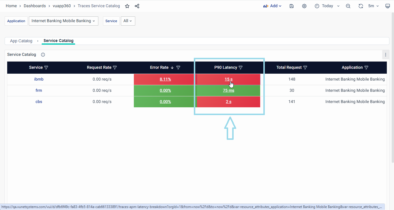
- Navigating to Latency Breakdown Page: Effortlessly access the Latency Breakdown Page by selecting the latency metric associated with your desired application from the Application Catalog page. With a simple click, you'll be directed to the Latency Breakdown Page, where you can analyze latency patterns for the chosen application. To explore the extensive features of this page, refer to the detailed Latency Breakdown section in this user guide.

By leveraging the App Catalog, users gain valuable insights into the applications' health, prioritize troubleshooting, and predict potential issues, ensuring a seamless user experience and smooth application performance.
Metrics Overview
The Metrics Overview dashboard within vuApp360 dashboards serves as a powerful tool for IT Ops, Application Owners, and Business Heads. It provides in-depth insights into application errors, latency performance, and allows for the precise identification of error sources within the environment. This comprehensive view enables stakeholders to address potential performance bottlenecks in the application ecosystem. To navigate to more granular details, such as Error Rate Breakdown and Latency Breakdown, users can seamlessly transition from the App Catalog page by clicking on the respective metrics. In the upcoming sections, we will explore each of these tabs, uncovering their functionalities in detail.
Error Rate Breakdown
Upon entering the Error Rate Breakdown tab, users are displayed a comprehensive landing page facilitating precise analysis.
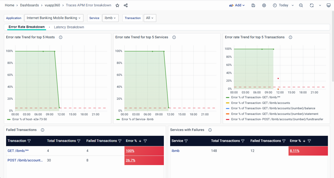
The interactive interface allows users to select the desired Application, Service, or Transaction, tailoring the analysis to specific parameters and enhancing the focus on relevant data points.
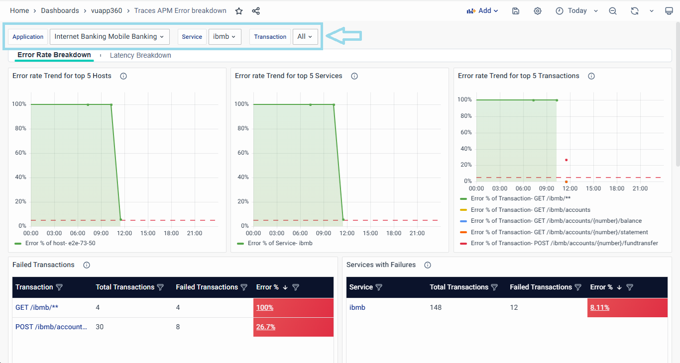
- The visual representation of the error rate percentage is provided against Hosts, Services, and API Transactions, enabling users to monitor and assess application health effectively.
- Failed Transactions: The table lists Transactions that have encountered errors, displaying only those with an error count greater than zero.
- Interactivity is enhanced as users can click on Transactions, leading them to the Trace Listing tab on the Service Overview Dashboard.
- Services with Failures: This table lists services that have encountered errors, filtering only those where the error count is greater than zero. A service is marked critical if the error rate exceeds 5%.
- Users can conveniently navigate to the corresponding Service Summary tab by clicking on entries under the Service column.
- Host with Failed API Transactions: This table displays hosts that have encountered errors, listing only those with an error count greater than zero. Hosts with an error rate of 5% or higher are categorized as critical, enabling quick identification and resolution of system-wide issues.
- Failed API Transactions per Service and Host: This table provides a detailed view of transactions based on failure rates across hosts, applications, and services. It only displays transactions with an error count greater than zero. Transactions with an error rate of 5% or higher are flagged as critical for immediate attention.
- Users can click on a transaction to drill down into the trace listing view for further analysis.
In all the above tables, clicking on the Error % column will navigate users to the Failed Traces Dashboard, allowing for deeper analysis and troubleshooting of failed transactions, services, and hosts.
Failed Traces Dashboard
The Failed Traces Dashboard provides a detailed view of failed transactions across applications, services, and hosts. It is a critical tool for troubleshooting and analyzing system failures by listing the most recent failed traces that encountered HTTP status codes greater than 399.
This dashboard presents up to 1000 recent failed traces from the selected applications, services, and transactions. Each trace represents a user request that failed at some stage in the system. By analyzing these traces, users can identify failure patterns, latency issues, and potential causes of errors.
Key Components
- Trace ID – A unique identifier for each failed trace. Clicking on a Trace ID navigates to the Trace Map Dashboard for an in-depth analysis of the trace execution.
- Transaction – Displays the API endpoint or function call where the failure occurred.
- Host – Identifies the host where the failed transaction was executed.
- Application – Indicates the application associated with the failed trace.
- Service – Displays the service name responsible for processing the failed request.
- Duration – Represents the total time taken to complete the user request before failure.
- Operation – The specific operation executed before the request failed.
- HTTP Status – Lists the HTTP response codes for the failed traces (e.g., 500, 502, 403, etc.).
- Status – Displays the outcome of the trace, with failed traces highlighted in red for quick identification.
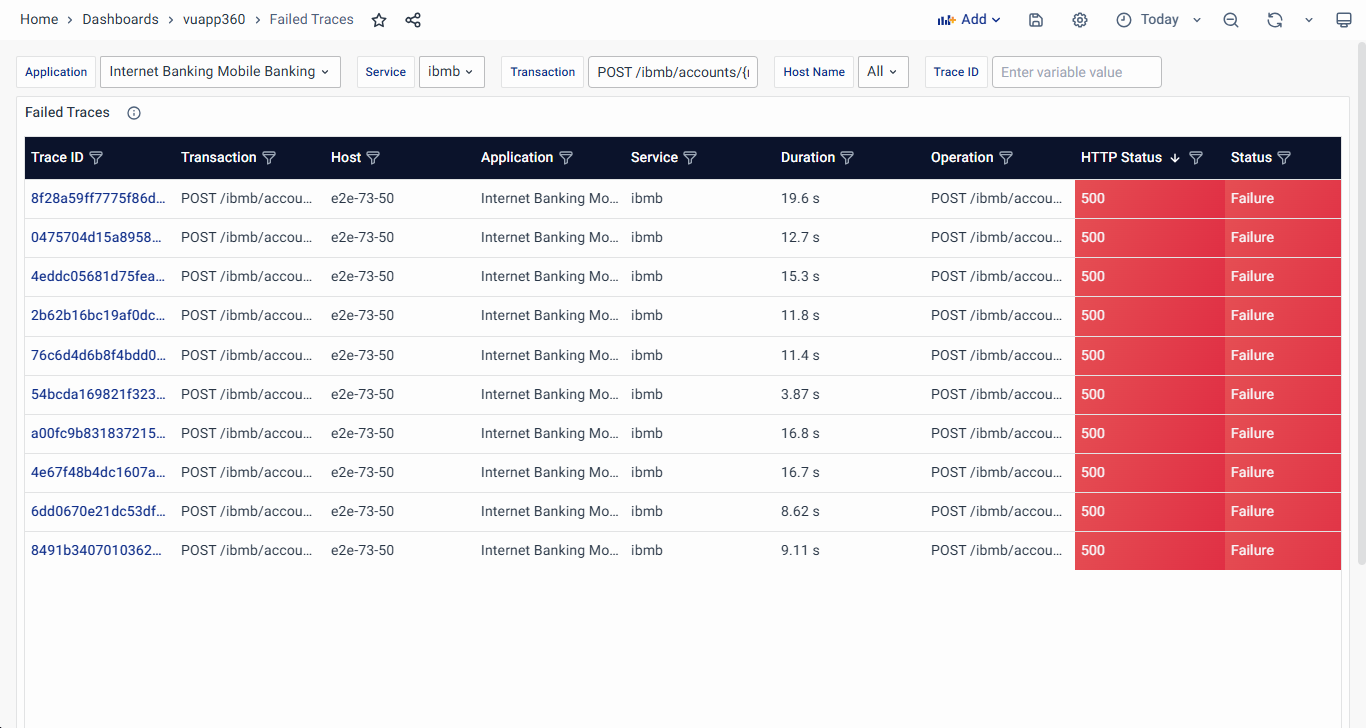
Interactivity and Navigation
- Clicking on a Trace ID navigates to the Trace Map Dashboard, where users can investigate the request's journey, identify bottlenecks, and analyze dependencies.
- Filtering Capabilities allow users to narrow down the results based on Trace ID, Transaction, Host, Application, Service, Duration, Operation, HTTP Status, and Status.
Latency Breakdown
Upon entering the Latency Breakdown tab, users are displayed a comprehensive landing page facilitating precise analysis.
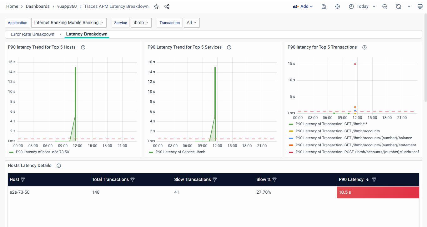
The interactive interface allows users to select the desired Application, tailoring the analysis to specific parameters and enhancing the focus on relevant data points.
- The visual representation of the latency is provided against Hosts, Services, and API Transactions, enabling users to monitor and assess application health effectively.
- Host with Slow API Transactions: This table displays the top 10 hosts experiencing high latency based on the 90th percentile (P90) latency measurement. Hosts with a P90 latency of 500 ms or more are categorized as critical, requiring immediate analysis and optimization to ensure system performance remains optimal. This section showcases hosts with slow Transactions with columns such as Host, Total Transactions, Number of Slow Transactions, Slow %, and P90 Latency.
- Services Latency Details: This table highlights the top 10 services experiencing high latency, based on the 90th percentile (P90) latency measurement. Services with a P90 latency of 500 ms or more are categorized as critical, requiring immediate investigation and optimization to maintain application performance. Displayed in a tabular format, this section highlights key metrics like Service, Total Transactions, Number of Slow Transactions, Slow%, and P90 Latency.
- Users can conveniently navigate to the corresponding Service Summary tab by clicking on entries under the Service column.
- Transaction Latency Details: This table lists the top 10 transactions experiencing high latency based on the 90th percentile (P90) latency measurement. Transactions with a P90 latency of 500 ms or more are categorized as critical, requiring immediate investigation and performance optimization. This table provides insights into specific slow API Transactions by presenting columns like Transactions, Total Transactions, Number of Slow Transactions, Slow %, and P90 Latency.
- API Transactions is clickable elements navigating to the Trace Listing tab on Service Overview Dashboard with pre-applied filters for this API transaction.
In all the above tables, clicking on the P90 Latency value will navigate users to the Slow Traces Dashboard, where they can analyze and troubleshoot slow traces in detail.
Slow Traces Dashboard
The Slow Traces Dashboard provides an overview of transactions with high latency across various applications, services, and hosts. This dashboard helps users analyze latency bottlenecks and performance degradation trends by listing traces that took longer than 500 ms to complete.
This dashboard displays up to 1000 recent slow traces, allowing users to investigate performance issues and optimize application response times.
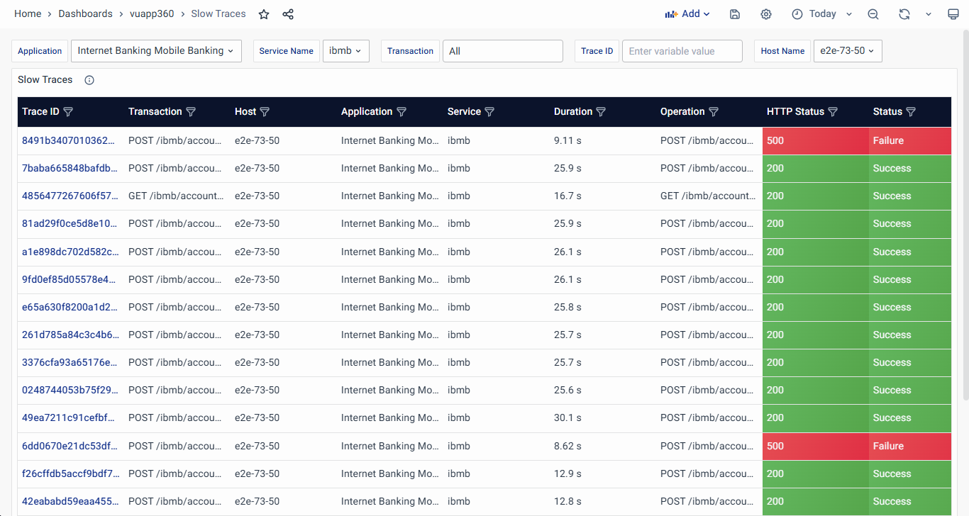
Key Components
- Trace ID – A unique identifier for each trace. Clicking on a Trace ID navigates to the Trace Map Dashboard for an in-depth analysis of execution time and dependencies.
- Transaction – Displays the API endpoint or function call where the latency issue was observed.
- Host – Identifies the host where the slow transaction was executed.
- Application – Indicates the application associated with the slow trace.
- Service – Displays the service name responsible for processing the slow request.
- Duration – Represents the total time taken to complete the user request. Traces exceeding 500 ms are listed in this panel.
- Operation – The specific operation executed during the request.
- HTTP Status – Shows the HTTP response codes, helping to distinguish between successful and failed requests.
- Status – Displays whether the transaction succeeded or failed, with slow failures requiring immediate attention.
Interactivity and Navigation
- Clicking on a Trace ID navigates to the Trace Map Dashboard, where users can analyze the transaction’s execution timeline and detect bottlenecks.
- Filtering Capabilities allow users to refine results based on Trace ID, Transaction, Host, Application, Service, Duration, Operation, HTTP Status, and Status.
Service Overview
The Service Overview in vuApp360 presents a multifaceted approach to analyzing and optimizing your application's performance. The dedicated tabs—Service Summary, Service Map, API Transaction, Analyze Errors, Analyze Latency, and Traces Listing—offer a comprehensive suite of tools for IT Ops, Application Owners, and Business Heads.
- Service Summary provides a consolidated view of individual services, offering insight cards with RED metrics and historical comparisons. Visualizations of Request Rate, Error Rate, and Latency empower users to identify trends, ensuring proactive decision-making.
- Service Map introduces an interactive graphical representation of service interactions, including 3rd party services. It provides real-time insights into service status, alerts, and latency, enhancing incident response and facilitating a detailed analysis of individual service performance.
- Transaction delves into the specifics of transactional performance, visualizing RED metrics over time. With the ability to analyze latency distribution, slow traces, and failed traces, this tab provides a nuanced understanding of API transactions.
- Analyze Errors offers a detailed analysis of errors, including occurrences over time, error messages, and insights into failed hosts, API transactions, and traces. This tab streamlines the identification and resolution of errors for improved application reliability.
- Analyze Latency focuses on latency distribution, slow API transactions, and traces. Visualizations and tables empower users to pinpoint and address latency issues, ensuring optimal application performance.
- Trace Listing provides a comprehensive list of individual traces across applications, services, and transactions. Users can filter and analyze traces to investigate execution times, request flows, and system failures, ensuring faster issue resolution and improved system observability.
With these tabs, Service Overview serves as a centralized hub for proactive monitoring, efficient issue resolution, and comprehensive insights into your application's health.
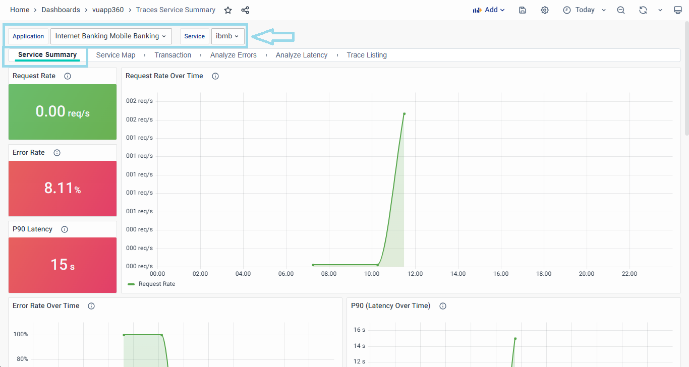
Service Summary
The Service Summary empowers you to observe and analyze the performance of individual services and their dependencies effectively. The Service Summary offers a consolidated view of your selected service within the application.
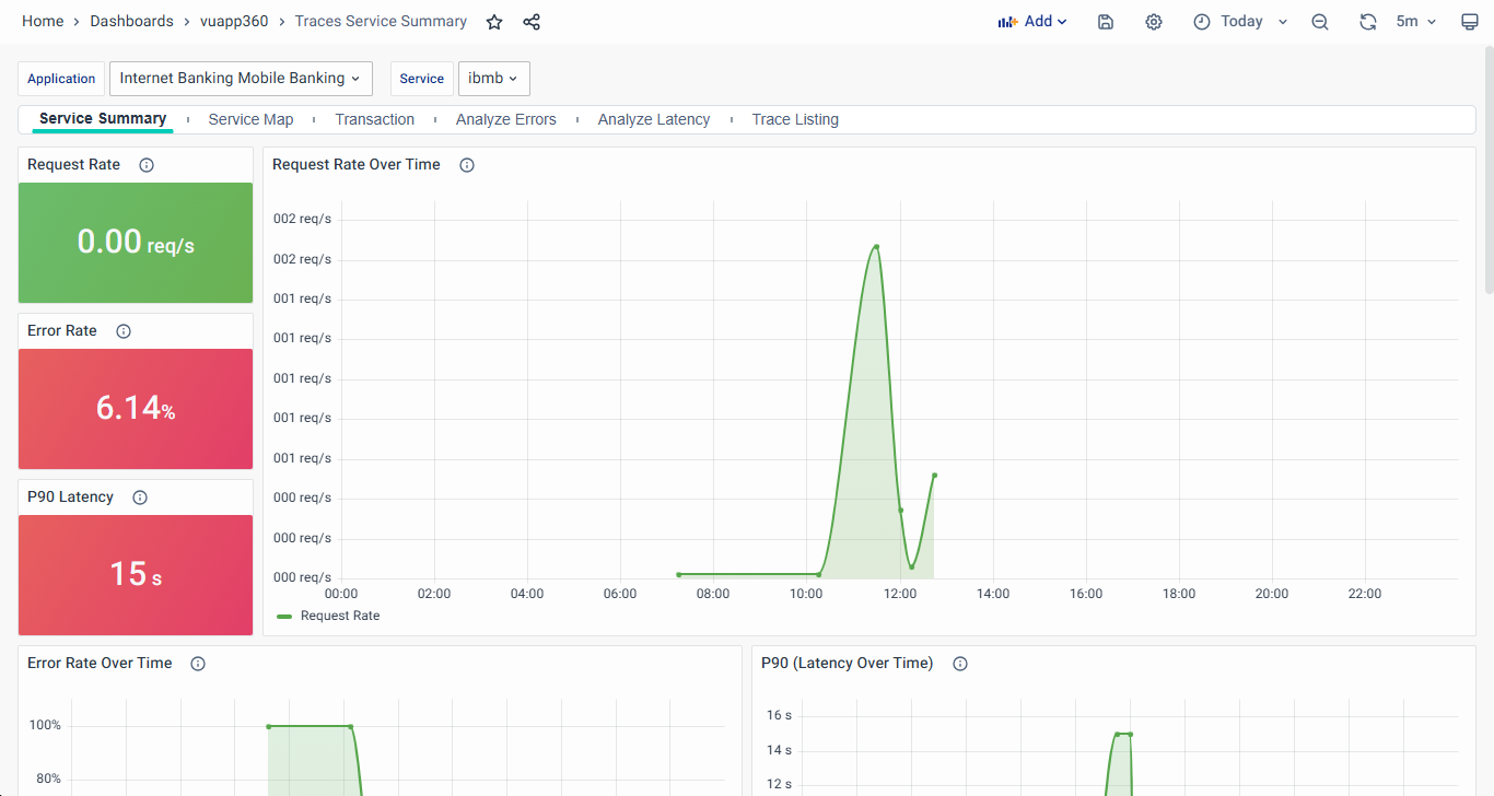
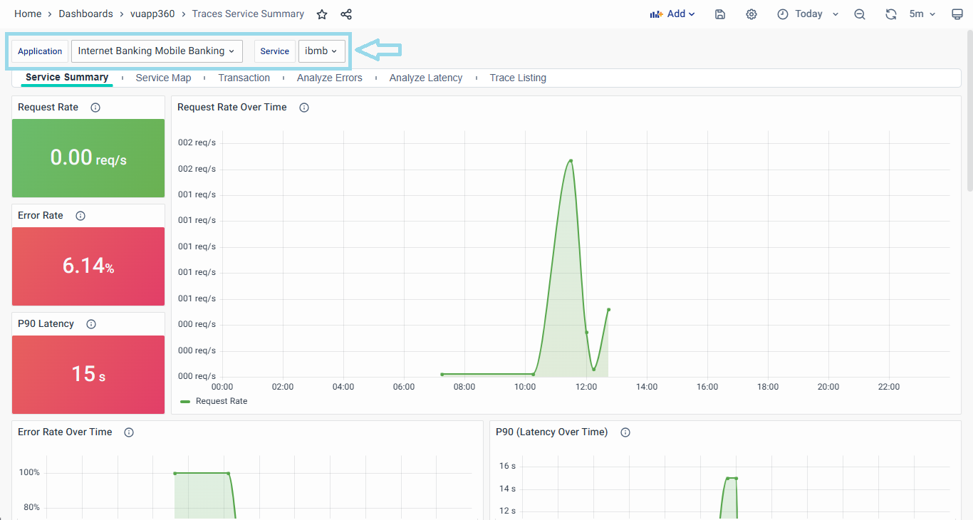
You can select the Service from the dropdown that is under consideration for analysis.
- On the Service Summary dashboard, you will find the insight cards displaying RED metrics.
- Request Rate, Error Rate, and Latency Graphs: These graphs offer pictorial representations of the respective metrics for the selected service. Visualizing these metrics enables you to spot trends and anomalies, facilitating proactive decision-making.
- Transactions: All the transactions related to this service are listed in this table. Their corresponding Request Rate, Error Rate and Latency (P90) are listed in this table. Additionally, Success % is also listed.
- The entries under the Transaction column are clickable, navigating you to the Trace Listing tab.
- All Hosts: A tabular column displaying all the hosts and their corresponding RED Metrics and success % are displayed.
- Dependencies: A tabular column displaying all the dependencies and their corresponding RED Metrics and Success % are displayed.
- Slow Operations: The slow operations for this service are listed in the table with their Start Time, Duration (in ms), HTTP Status Code, and Timestamp.
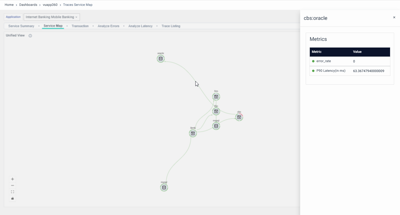
Service Map
The Graphical View introduces an interactive Service Map, visually representing how various services interact with each other for a particular application. This graphical representation helps you understand service dependencies and interactions. The Service Map includes the following features:
- Service Interaction Visualization: The Service Map offers a clear view of service interactions, illustrating how services interact with each other and how multiple services collaborate to process a request. Directional arrows facilitate the comprehension of the interrelation between services by indicating the flow of communication from one service to another.
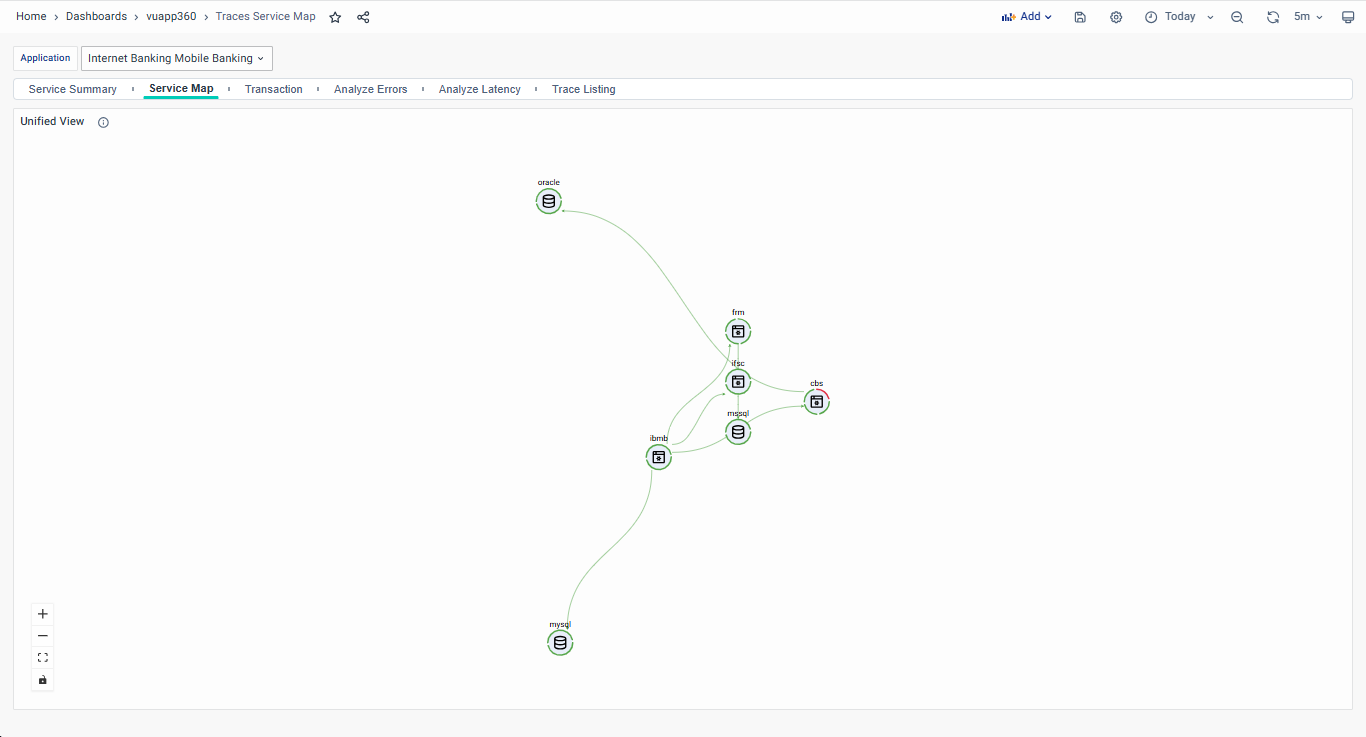
- Inclusion of 3rd Party Services: The Service Map encompasses 3rd party services like DB, Kafka, Redis, and others. You can observe their status and observe their interactions with application services, facilitating holistic performance observability.
The current release of product has certain limitations with showcasing DB components in Service map. Also repositioning of nodes in the service map is not possible.
- Service Status and Alerts: The color of the service in the Service Map turns Amber or Red based on its status, P90 latency, and error rate. This visual cue alerts you to critical issues that require immediate attention, enhancing incident response. If nodes/ links are in green color, if no issues are observed.
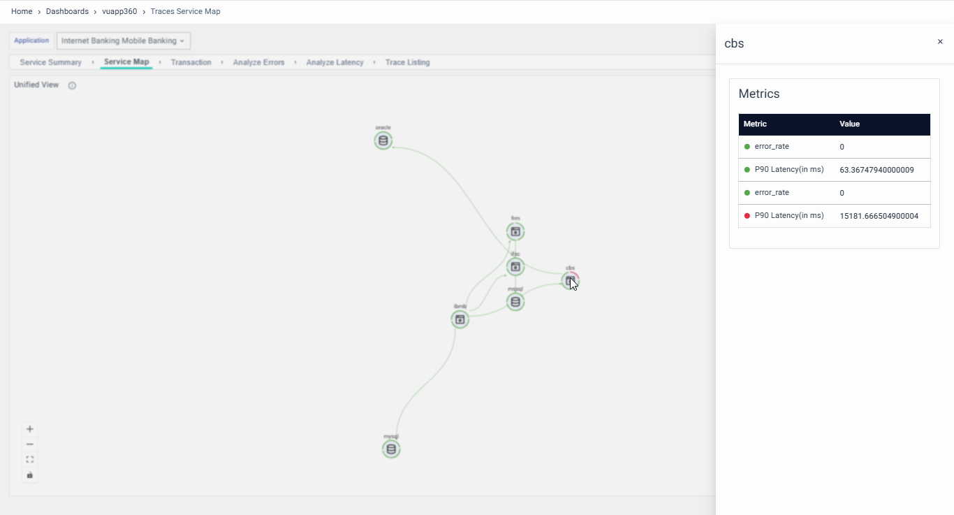
- Detailed Service Insights: By clicking on any service, users can see RED metrics for that particular service, including its status. This feature streamlines the analysis of individual service performance.
- Latency Visualization: The Service Map visually represents the latency between services using links connecting them. The color of these links changes based on latency SLAs or active alerts, providing quick insights into potential performance bottlenecks.
- You can zoom in, zoom out, fit to screen the service map with options available on the right side.
- The automatic Service Map can handle up to 100 services interacting with each other.
- Data can load in near real-time for up to 100,000 events per second (EPS).
Transaction
The third tab on the Service Overview Dashboard visualizes the Transactions.
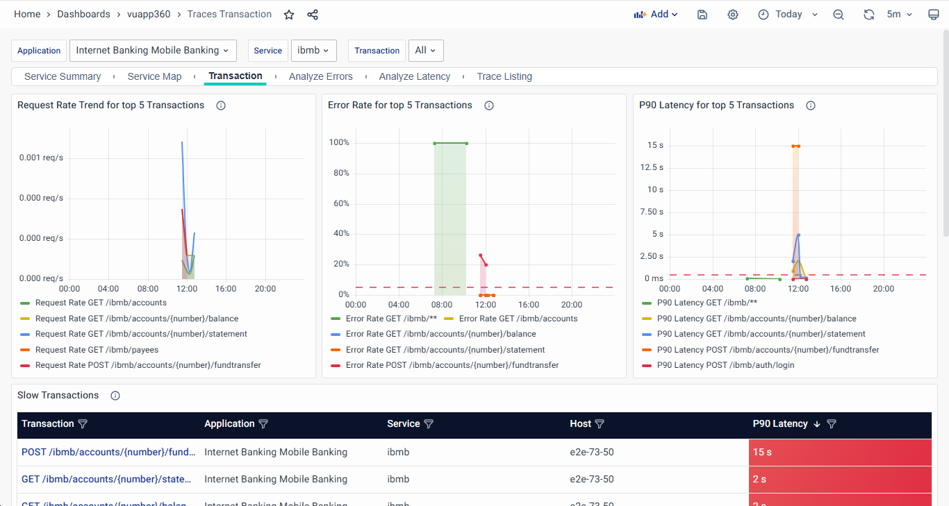
On the top, you can select the API Transaction to be observed in the dashboard. By default, All will be selected. Whereas, if you are navigated to this tab, by clicking on a particular API Transaction, that particular API Transaction will be pre-applied. Additionally, you can also update filters for Application and Service if required.
- On the top of this dashboard, visualizations of RED metrics against time are shown for the selected API Transaction.
- Slow Transactions: The High Latency Transactions Table lists the top 5 transactions with the highest P90 latency, exceeding 500 ms. Transactions in this table are marked as critical for performance monitoring. Clicking on a transaction navigates to the Trace Listing Dashboard, allowing users to analyze associated traces and identify latency bottlenecks for optimization.
- Latency Distribution: This graph visualizes the number of traces falling within various ranges of the 90th percentile (P90) latency. It displays the count of the top 500 traces based on their latency, helping users assess performance trends.
You can select a particular range with click & drag to be analyzed in detail on any visualization. This will apply the selected range as a time range filter.
- Transaction Details: This table lists the top 100 transactions based on their failure rate across hosts, applications, and services. Transactions meeting the critical threshold of either Error Rate ≥ 5% or P90 Latency ≥ 500 ms are highlighted for further analysis.
- Clicking on a transaction navigates to the Trace Listing Dashboard, allowing users to drill down into the detailed trace view for deeper investigation.
Analyze Errors
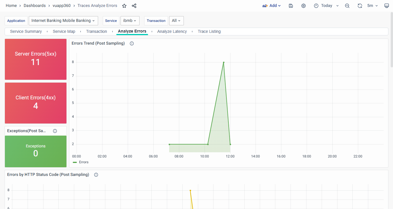
- The statistics of Server Errors (5xx), Client Errors (4xx), and Exceptions are displayed on the console.
- Clicking on Server Errors (5xx) navigates users to the Server Error Traces Dashboard for detailed analysis of server-side failures.
- Clicking on Client Errors (4xx) redirects users to the Client Error Traces Dashboard, helping identify and troubleshoot client-side errors.
- Errors Trend: This chart visualizes the trend of failed transactions over time, helping users identify error patterns and analyze system reliability.
- Errors by HTTP Status Code: This chart displays the trend of failed transactions over time, categorized by HTTP status codes. It helps users track error occurrences and analyze failure patterns.
- Error Messages for Exceptions: This table lists error messages and exceptions for the selected application, service, and transaction, helping users analyze failure patterns and troubleshoot issues efficiently.
- The Failures per Host panel displays the failure rate, request rate, and 90th percentile (P90) latency for each host, helping users identify performance issues. Hosts with an error rate above 5% or P90 latency exceeding 500ms are highlighted in red for quick identification.
- The Failed Transactions table lists transactions that have encountered failures across different hosts, applications, and services. Users can click on a transaction to navigate to the Trace Listing Dashboard for further analysis. Transactions with an error rate of 5% or more are categorized as critical and require immediate attention.
- The Failed Operations table provides insights into operations with high failure rates across multiple services and hosts. Operations exceeding an error rate of 5% are marked as critical. These metrics are calculated using post-sampling data, and no pre-sampling metrics are available for this table.
Clicking on the Error % column will navigate users to the Failed Traces Dashboard, allowing for deeper analysis and troubleshooting of failed transactions, services, and hosts.
Server Error Traces Dashboard
The Server Error Traces Dashboard provides insights into failed transactions categorized as server errors (HTTP status codes 499 to 600) across selected applications, services, and transactions. It lists the most recent 1000 traces that encountered server-side failures, allowing users to analyze error trends and troubleshoot issues efficiently.
Key Components:
- Trace ID: Unique identifier for each failed request. Clicking on it navigates to the Trace Map Dashboard for deeper investigation.
- Transaction: API endpoint where the error occurred.
- Host: The machine processing the failed request.
- Application & Service: The application and service linked to the transaction.
- Duration: The time taken for the user request before failure.
- Operation: The specific API method executed.
- HTTP Status: Displays server error codes (e.g., 500, 502, 503, etc.), indicating failure reasons.
- Status: Highlights failed transactions in red for quick identification.
This dashboard enables users to detect server-side failures, investigate recurring issues, and take corrective measures for system reliability.

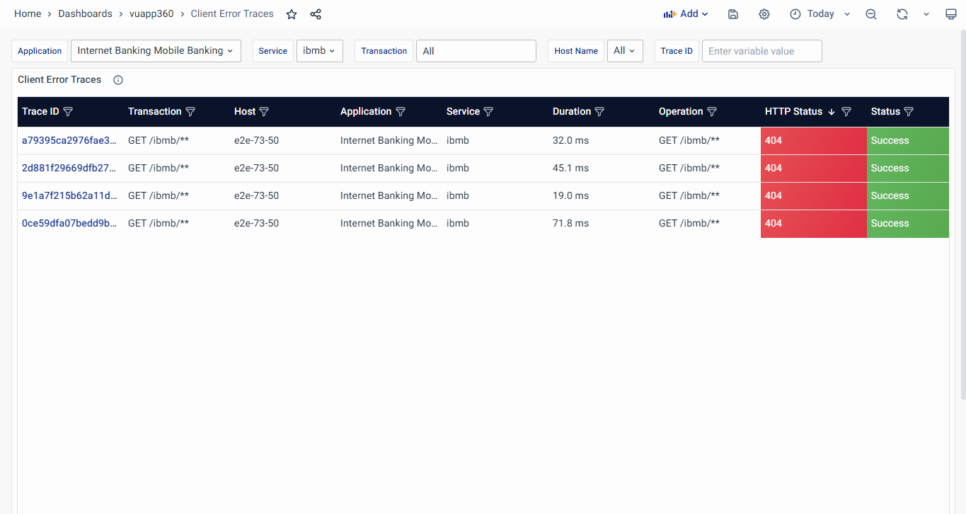
Client Error Traces Dashboard
The Client Error Traces Dashboard captures transactions that failed due to client-side errors (HTTP status codes 399 to 500). It lists the most recent 1000 traces, helping users analyze client-related failures such as authentication issues, invalid requests, or permission errors.
Key Components:
- Trace ID: Unique identifier for each failed request. Clicking on it navigates to the Trace Map Dashboard for further analysis.
- Transaction: The specific API or URL where the failure occurred.
- Host: The system processing the request.
- Application & Service: Identifies the application and service involved.
- Duration: The total request execution time.
- Operation: The executed API method.
- HTTP Status: Displays client error codes (e.g., 400, 403, 404, etc.), indicating the failure reason.
- Status: Failed client-side transactions are highlighted in red for visibility.
This dashboard helps users diagnose incorrect client requests, improve API handling, and enhance error resolution for a smoother user experience.
Analyze Latency
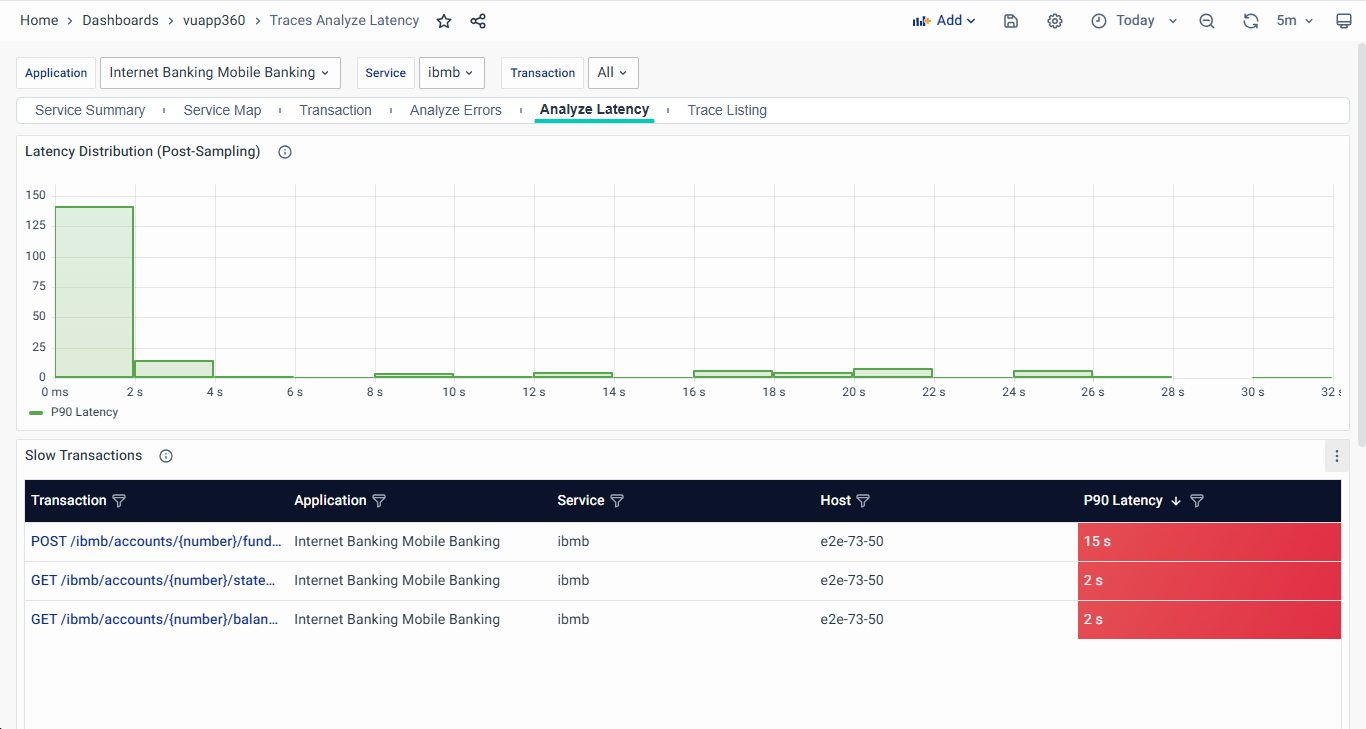
- Latency Distribution: Number of Traces against their latency is statistically visualized in this graph.
- Slow Transactions: For the slow API transactions, API transaction name, Request Rate, and P90 Latency are listed in the tabular columns. The API transactions are clickable navigating to the Trace Listing tab.
- Latency Visualizations: The statistical bar chart for Latency Distribution by Host, Top 100 Transaction based on latency, and Top 100 dependencies based on latency are visualized.
Trace Listing
The Trace Listing Dashboard provides a comprehensive list of individual traces across selected applications, services, and transactions. It allows users to analyze request execution times, identify failures, and track system performance efficiently.
This dashboard displays the most recent 1000 traces, helping users investigate and optimize application behavior. Each trace represents a user request, allowing deeper insights into its execution and dependencies.
Key Components
- Trace ID – A unique identifier for each trace. Clicking on a Trace ID provides two options for navigation:
- Full Trace: Opens the Trace Map Dashboard for this specific Trace ID, displaying its full execution path.
- Trace with Filters: Applies Service and Transaction filters for the selected Trace ID and then opens the Trace Map Dashboard, helping users analyze similar transactions for the service in focus.
- Transaction – Displays the API endpoint or function where the trace was recorded.
- Host – Identifies the host processing the trace.
- Application – Indicates the application associated with the trace.
- Service – Displays the service name handling the request.
- Duration – Represents the total time taken to complete the user request.
- Operation – Specifies the execution operation during the trace.
- HTTP Status – Shows the response code of the trace (e.g., 200 for success, 500 for failure).
- Status – Indicates whether the transaction succeeded or failed, with failures highlighted in red.
Interactivity and Navigation
- Clicking on a Trace ID provides two options:
- Filtering Capabilities allow users to refine traces based on Application, Service, Transaction, Host, Trace ID, HTTP Status Code, and Duration.
Trace Map
The Trace Map presents an organized, hierarchical view of a trace's progression across various services and components, capturing key steps in the trace and their associated metrics.
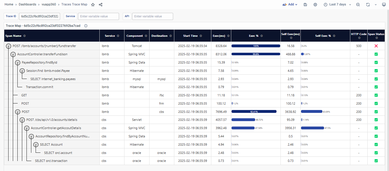
Key Components of the Trace Map:
The following fields provide in-depth insights into each span in the Trace Map:
- Span Name: The Span Name represents individual operations or actions within a trace. Each span corresponds to a specific step in processing a request, such as a function call, database query, or HTTP request. These spans are arranged hierarchically to show the sequence and structure of the request flow.
- Service: Service identifies the application or microservice responsible for executing a particular operation captured by a span. It provides insight into which part of your system is handling the specific span operation.
- Component: Component refers to the technology, framework, or library used within a service to execute the operation captured by the span. It offers visibility into the specific tool or mechanism that powers the operation.
- Destination: Destination indicates the target system, service, or resource with which the span interacts. It highlights where a request is directed during the span’s operation, such as a database, external API, or another microservice.
- Start Time: Start Time shows when the span’s execution began, providing a timestamp for each step of the trace. This helps to construct a timeline, enabling you to analyze the sequence and timing of operations.
- Execution Time (Exec(ms)): This represents the total execution time for the span, including any dependent child spans. It shows how long the operation and its sub-operations took to complete.
- Self Execution (Self Exec % and Self Exec(ms)): Self Exec % is the percentage of the total trace execution time spent solely on the span itself, excluding time taken by nested or dependent operations. This focuses on the span's own execution time. Self Exec(ms) measures the time the span took to execute without counting the time taken by any child or dependent spans.
- HTTP Code: The HTTP Code represents the status code returned for spans involving HTTP requests or responses. It indicates the success or failure of an HTTP operation. Common HTTP codes include:
- 200-299: Success (indicated in green)
- 300-399: Redirection (indicated in orange)
- 400+: Errors (indicated in red)
- Span Status: Span Status represents the overall outcome of an operation captured by the span. It reflects whether the operation completed successfully or encountered an issue during execution. Note that the Span Status reflects the application's internal logic, while the HTTP status code adheres to standard client-server protocols. Even if the HTTP code indicates an error (e.g., 400 or 500), the span status may still indicate success if the error was handled gracefully by the application.
